Hot Pot
Introduction
Hot Pot is a cooking app designed to make cooking easy. It helps users quickly find time sensitive recipes that fits their needs. A unique feature this app offers is the ability to search for recipes based on ingredients the user already has in their kitchen. Our target audience is users between the ages of 18 to 30, with this age range consisting mostly of college students, young adults, and parents.
Strategy
Many people refrain from cooking due to time consumption and budgeting. Hot Pot focuses on time and efficiency, providing our users with recipes that reflect their lifestyle. Users should be able to categorize recipes based on thier current needs such as, budget, cravings, dietary needs, time and duration. Our primary focus is on efficiency, convenience and creating a user friendly interface.
Flowchart
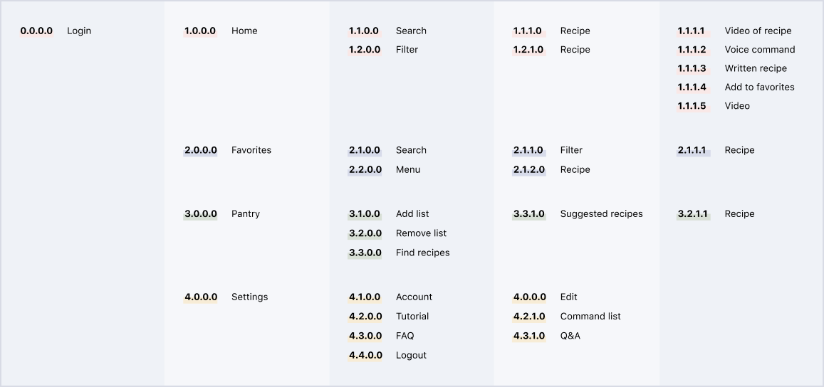
Creating a comprehensive flowchart helped pave the way for the development of Hot Pot. Using this as a rough guideline, we continued to the prototying phase of the project.
Prototyping
Creating a comprehensive flowchart helped pave the way for the development of Hot Pot. Using this as a rough guideline, we continued to the prototying phase of the project.
Branding
An iconic cooking ware paired with a classic checkered pattern creates an immediate cooking connotation for the viewer. The soft colors and bright red lid on the hot pot retains the friendly cooking theme. A subtle gradient background allows the Hot Pot badge to pop off the background, improving it’s presence on various assets such as an app icon or favicon.

After initial sketches, I focused on the idea of a rice cooker to represent the icon of the app. I found that a more traditional rice cooker best resembles a hot pot. The background grid laid over a beige gradient gives the icon more depth and better unifies the appearance with other iOS apps on the market.
Interface Design
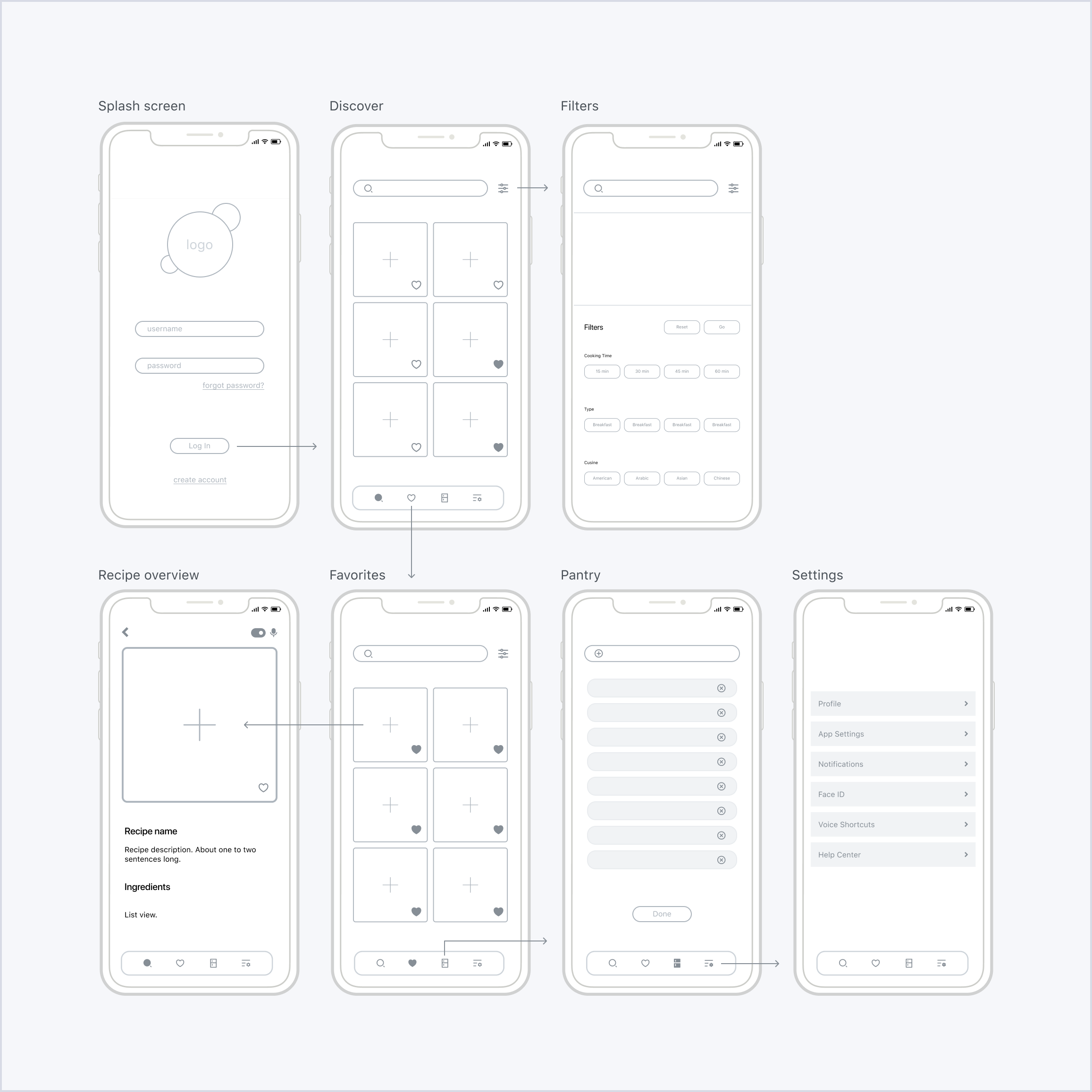
Several screens with different designs were creaed to get a sense of how the app might appear moving forward. We focused on creating a clean and straight forward design for all users. During the research phase, we came to the conclusion that users would like the implementation of voice control, creating a hands free app that helps the user focus on their task.
-
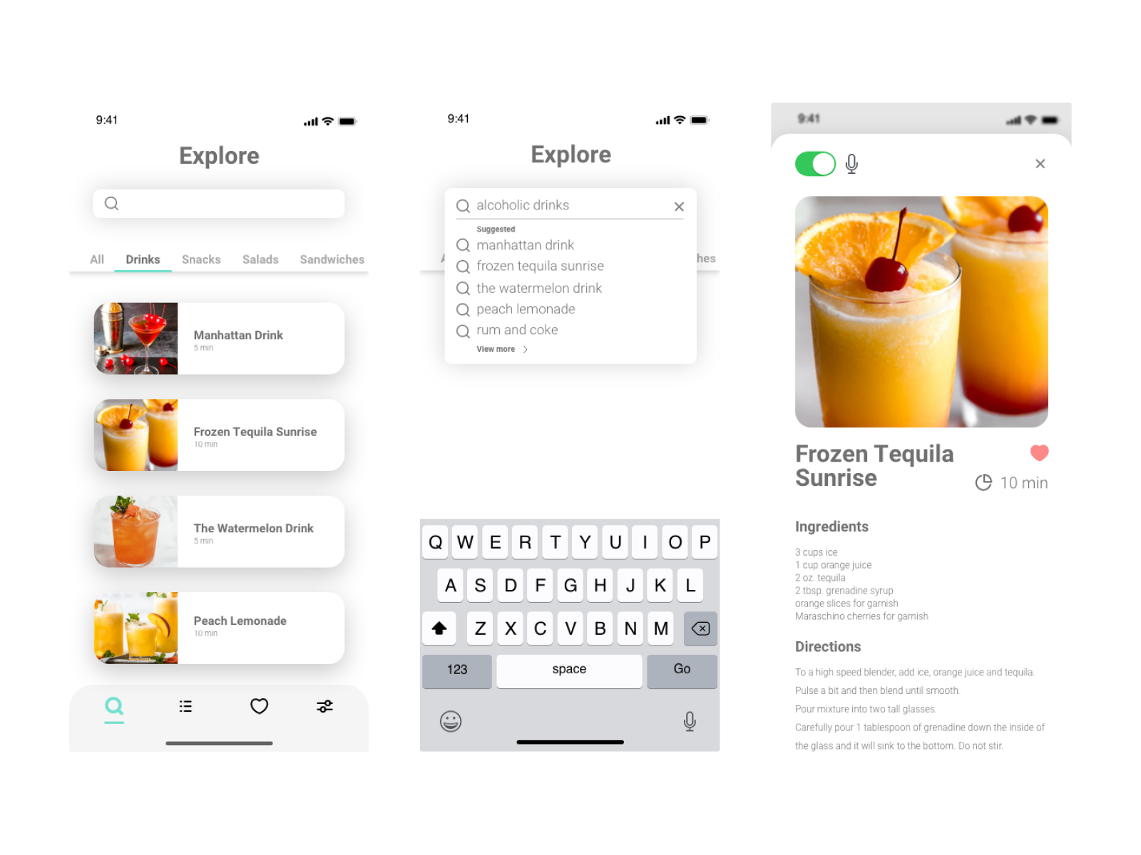 The first draft focused on the use of filters and vertical cards that the user would swipe through and search for the desired recipe.
-
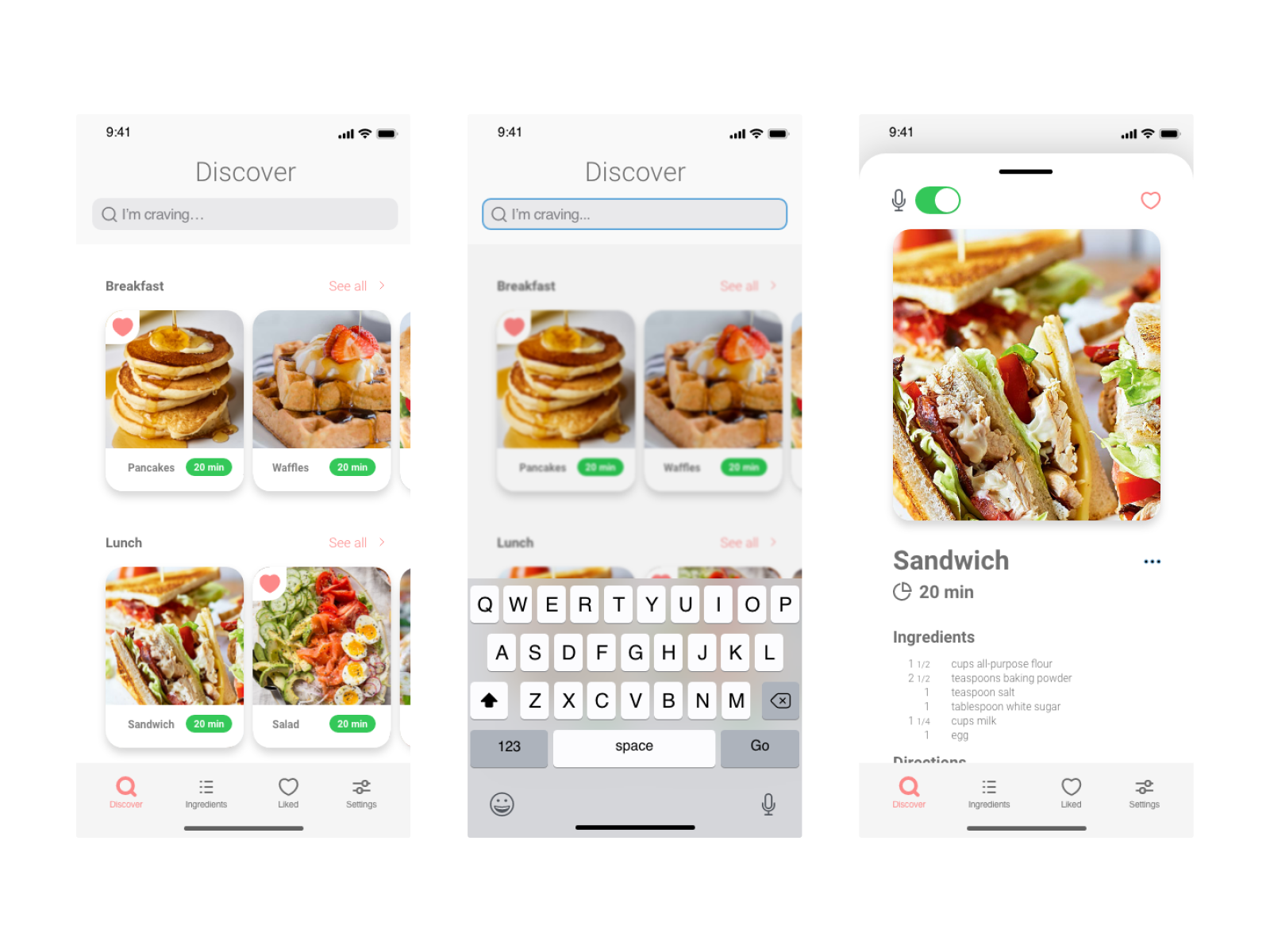 The second draft categorizes food items based on the time of day, and would let users search for their cravings.
Final Screens
The following screens are examples of what the user will see when navigating certain parts of the app, not all screens are displayed in this case study.
↑
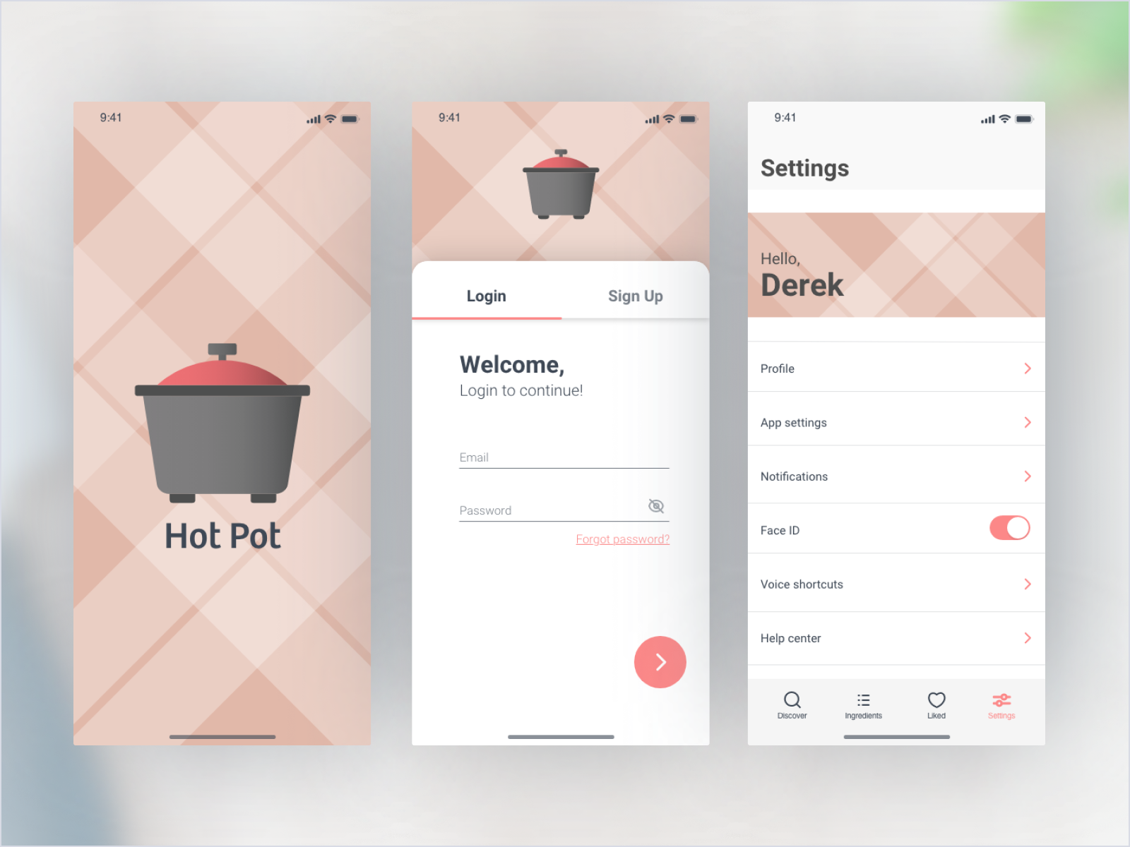
Onboarding Screens & Settings
The onboarding and setting screens showcase a plaid pattern. The idea behind Hot Pot being a cooking app, I found it appropriate to use this pattern.
↑
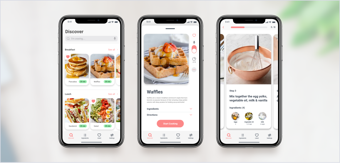
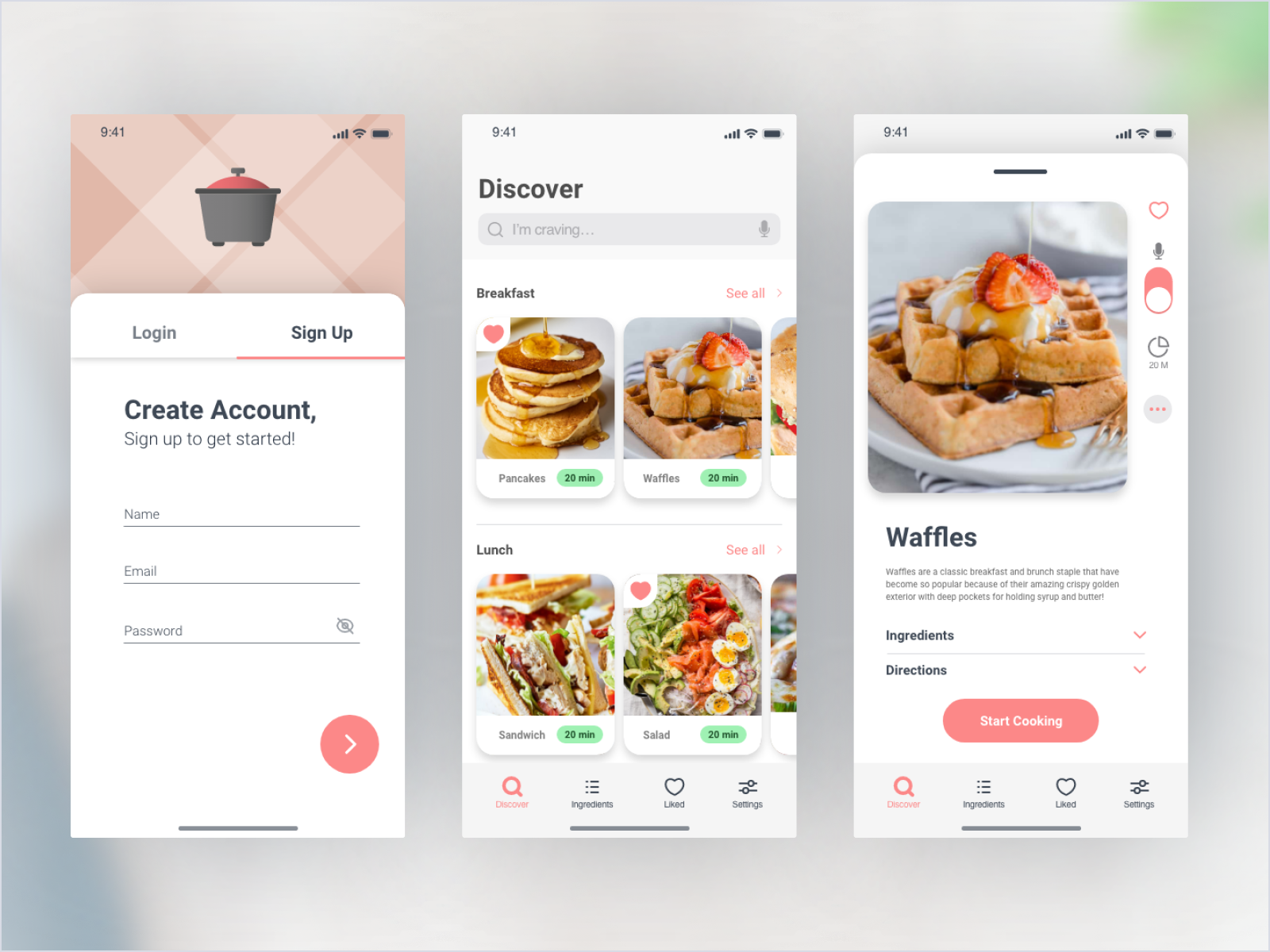
Sign Up, Discover & Recipe
After signing up, the user can browse through a collection of recipes. Upon selecting a recipe, the use will be able to see the ingredients and cooking instructions.
↑
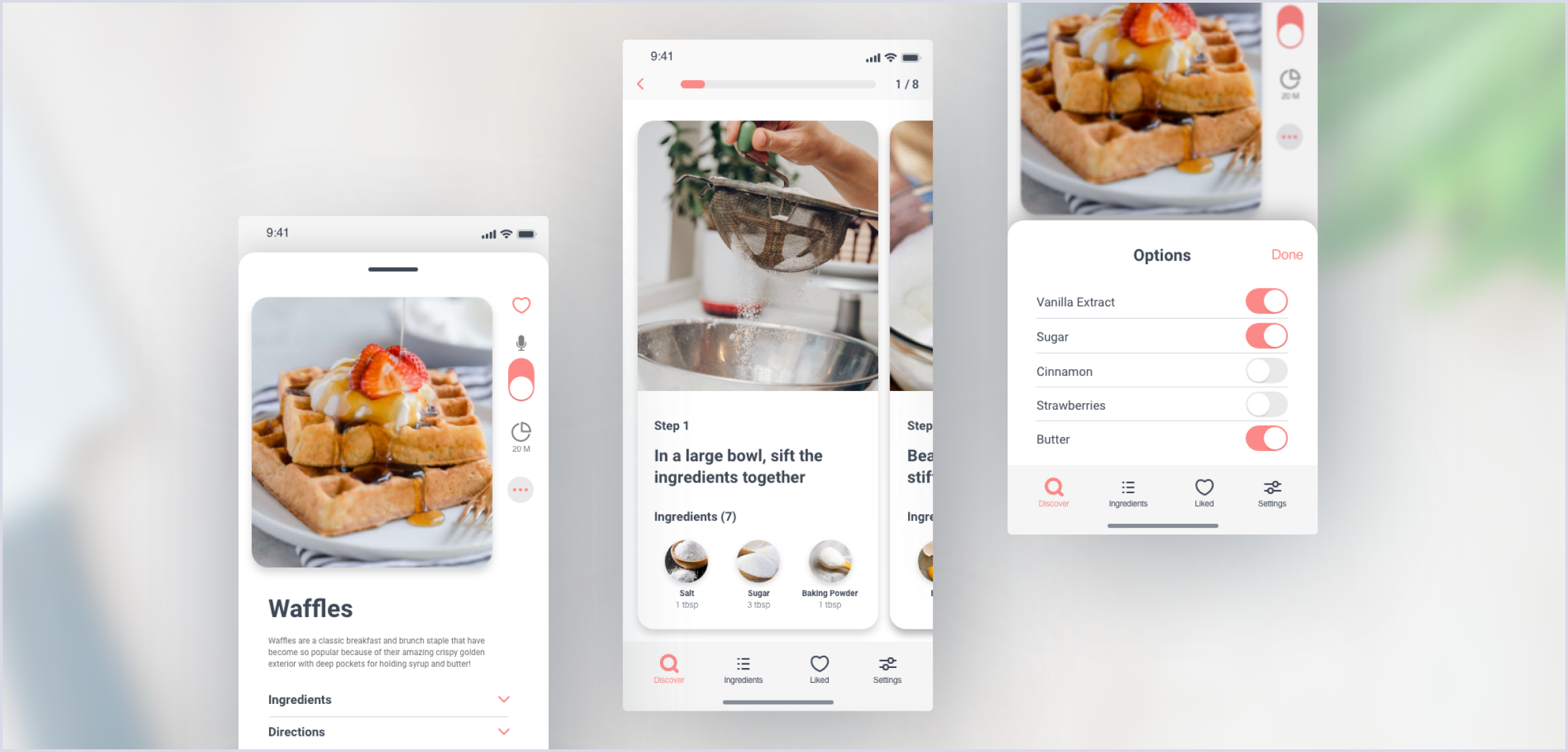
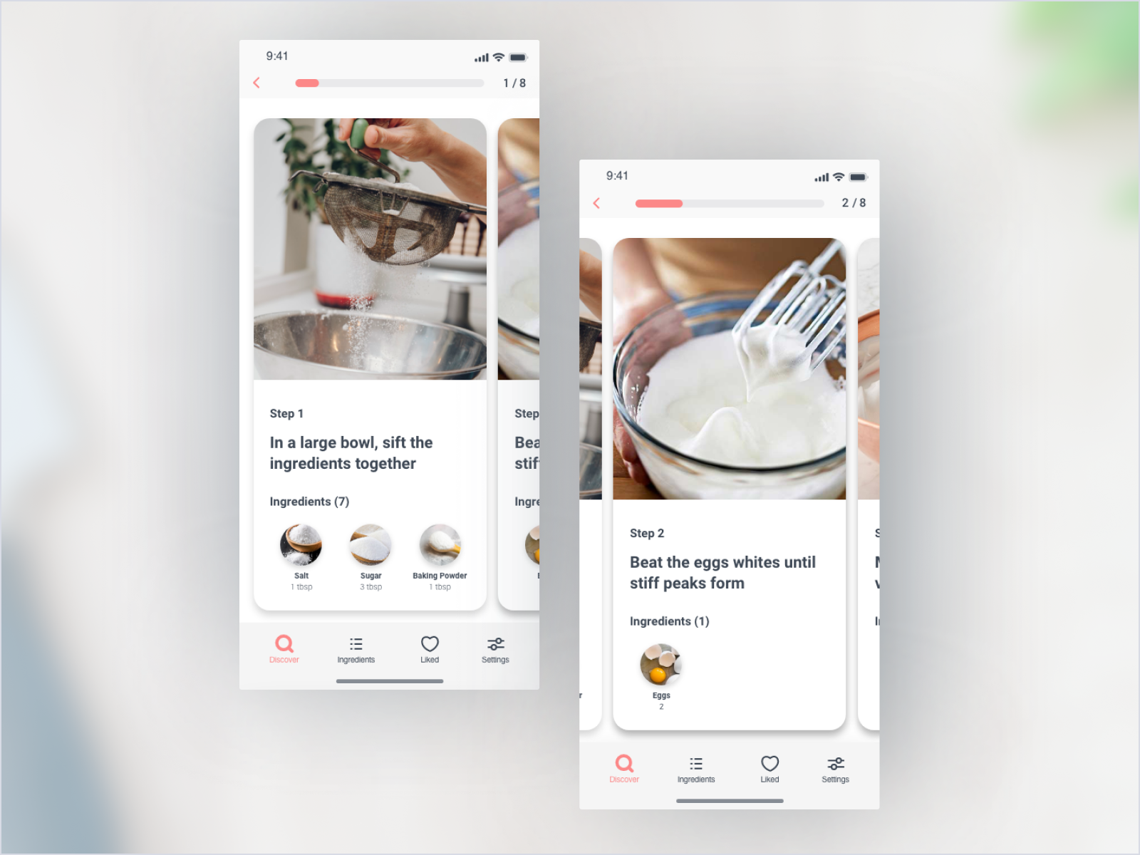
Cooking Instructions
The cooking instructions utilizes the use of a progress bar, allowing the user to see how many steps are left in the cooking process. The step by step interface showcases cards on the sliding carousel.
↑
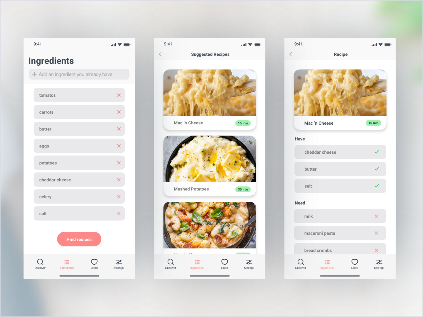
Pantry Screens
A unique feature Hot Pot offers is the ability to produce recipes based on the current ingredients in the user's home.