Flock
Adobe Creative Jam + Twitch
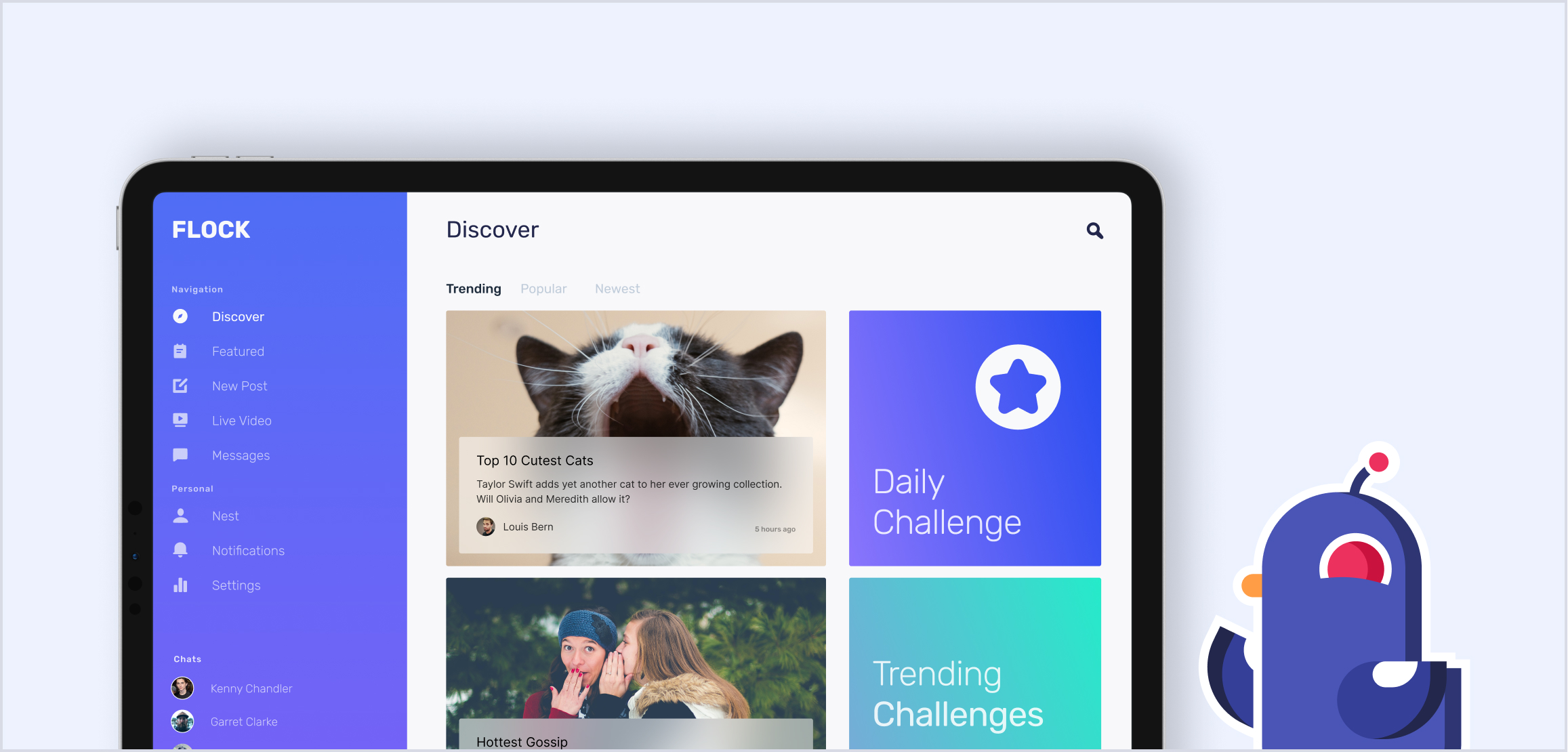
Welcome to Flock! Mag-bot is a badge collecting magpie that will help you collect your own badges as you explore content and meet new people. Through the onboarding process, you will select interests to curate your feed and introduce you to content catered to you. Within the app, you will have access to your Nest where all your personal content will lie to be organized and viewed by other users. Here you’ll also be able to see the badges you’ve collected through your journey. Badges are earned through a variety of different actions and will encourage you to explore communities that you usually wouldn’t find on your own. Through the discover page you will see content made by other creators and be able to participate in skill-building challenges that help you learn and earn badges. Flock is the best way to connect with communities and share your talents with the world.
Interface Design
Final Screens
↑
Onboarding
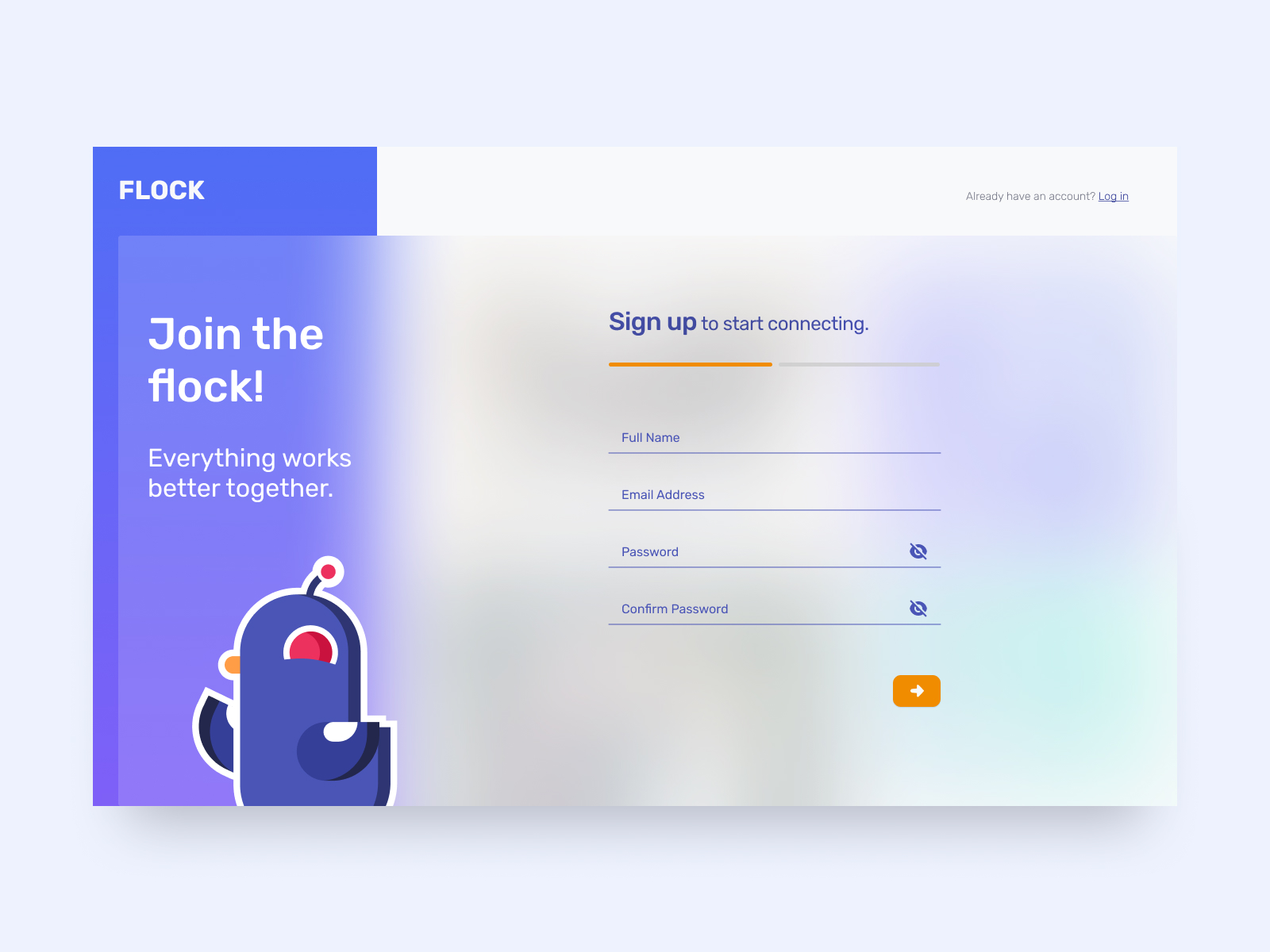
Sign up, personal information.
↑
Onboarding
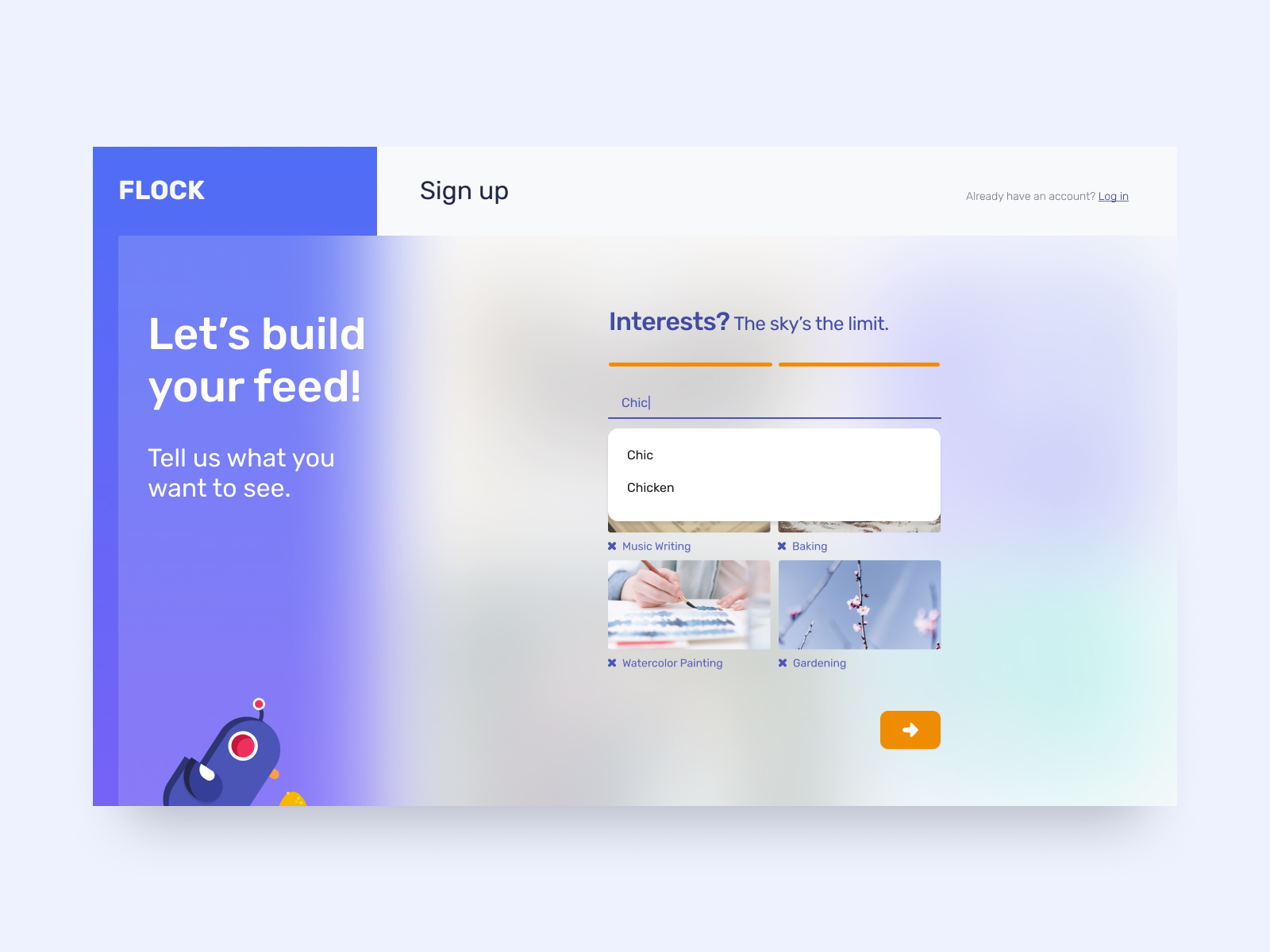
Search for personal interests to curate your fyp.
↑
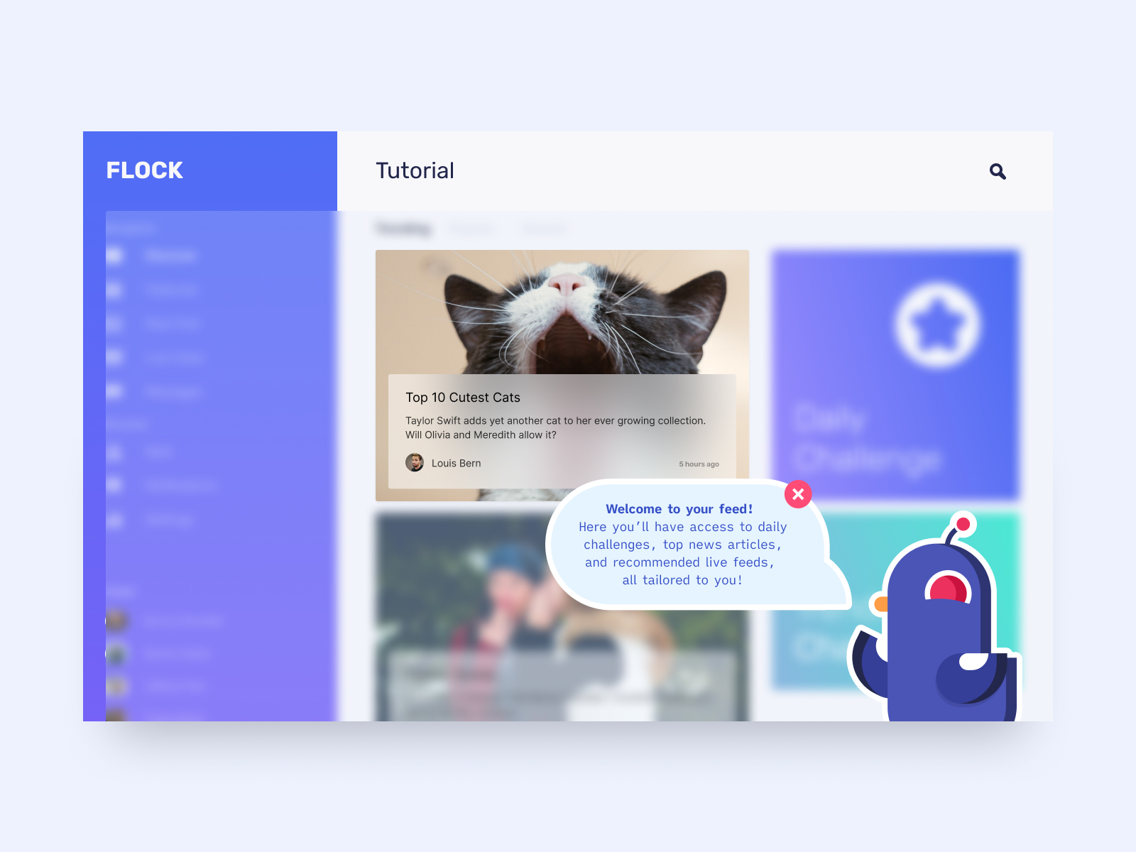
Profile Tutorial
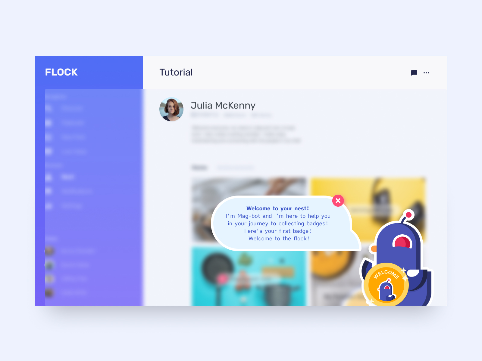
Mag-bot walks you through your Nest profile.
↑
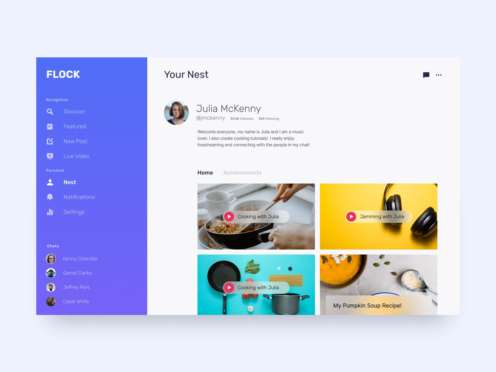
Nest Profile
Your Nest houses your personal profile information. Locate your digital content and keep track of your badge achievements.
↑
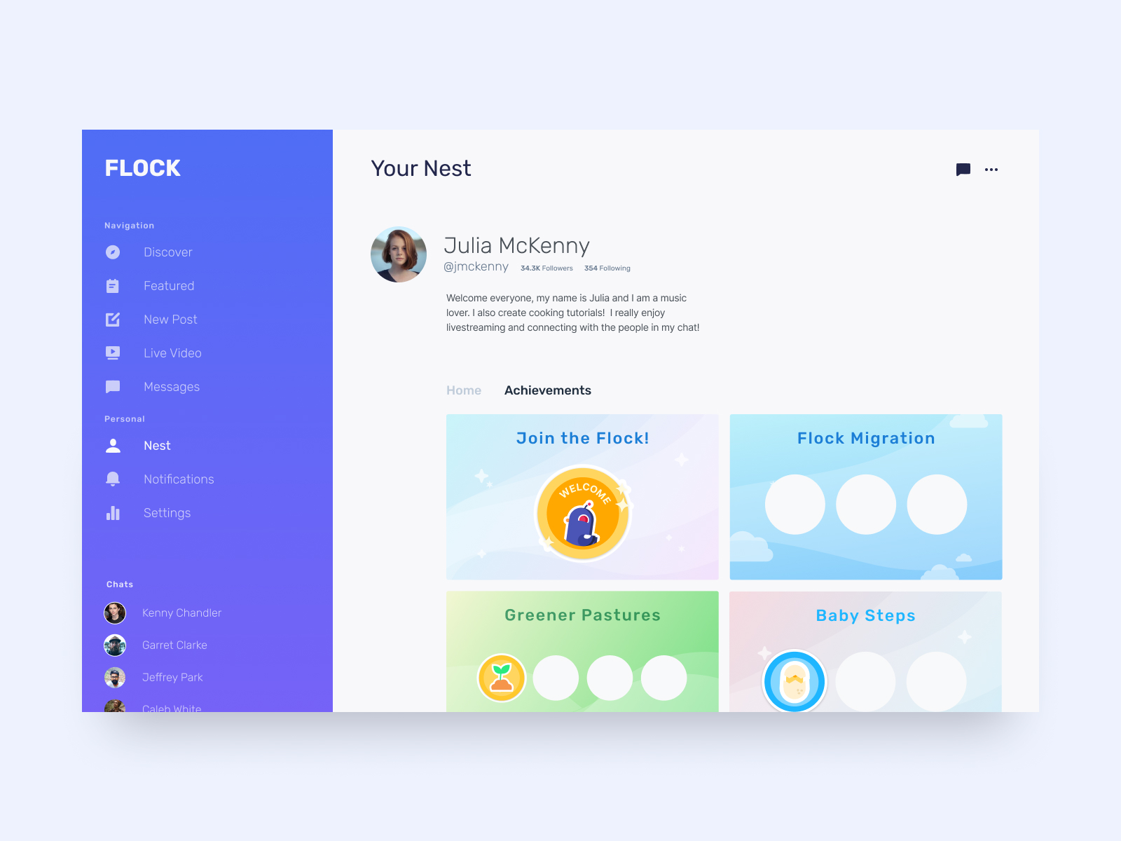
Badge Achievements
Badges you collect will be displayed here.
↑
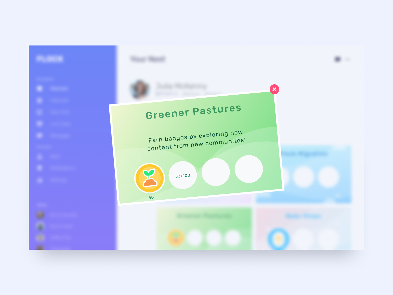
Card Information
Select a card to view details.
↑
Feed Tutorial
Curated content will appear here. Daily and trending challenges
↑
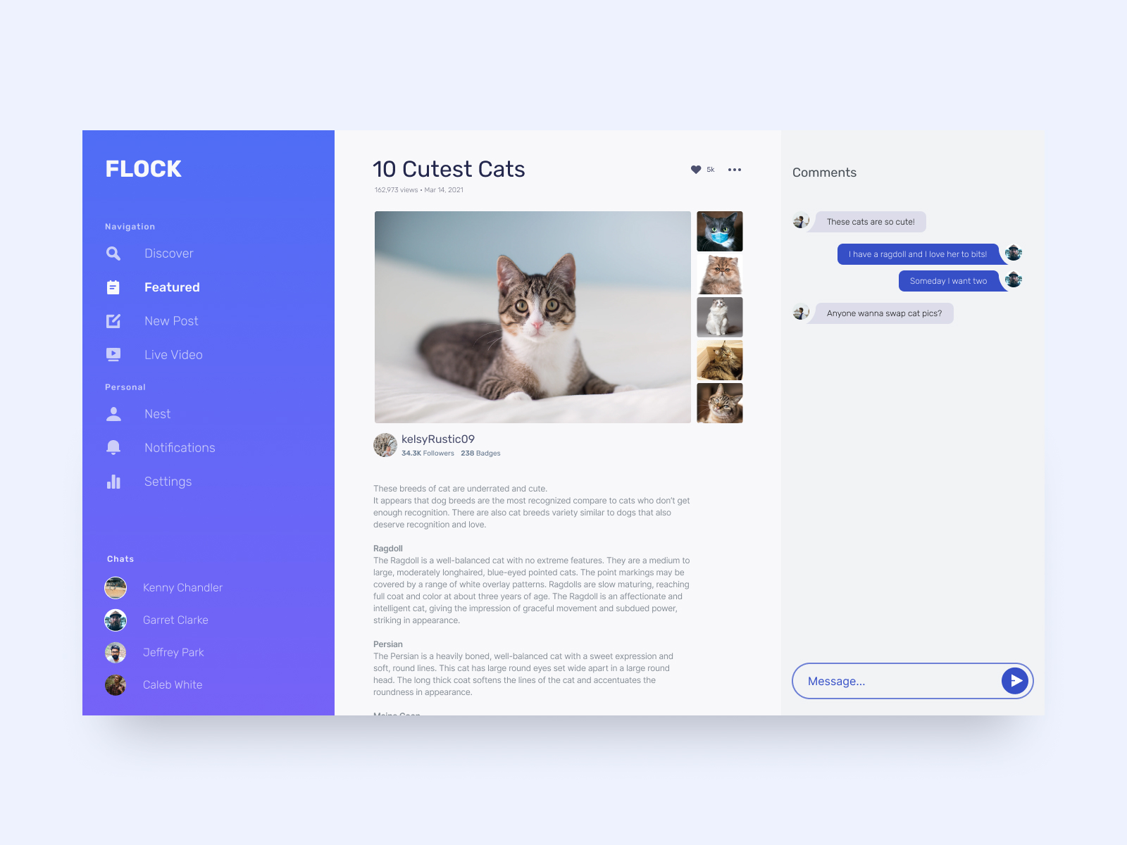
Article + Comments
Flock highlights the building of connections in new communities.
↑
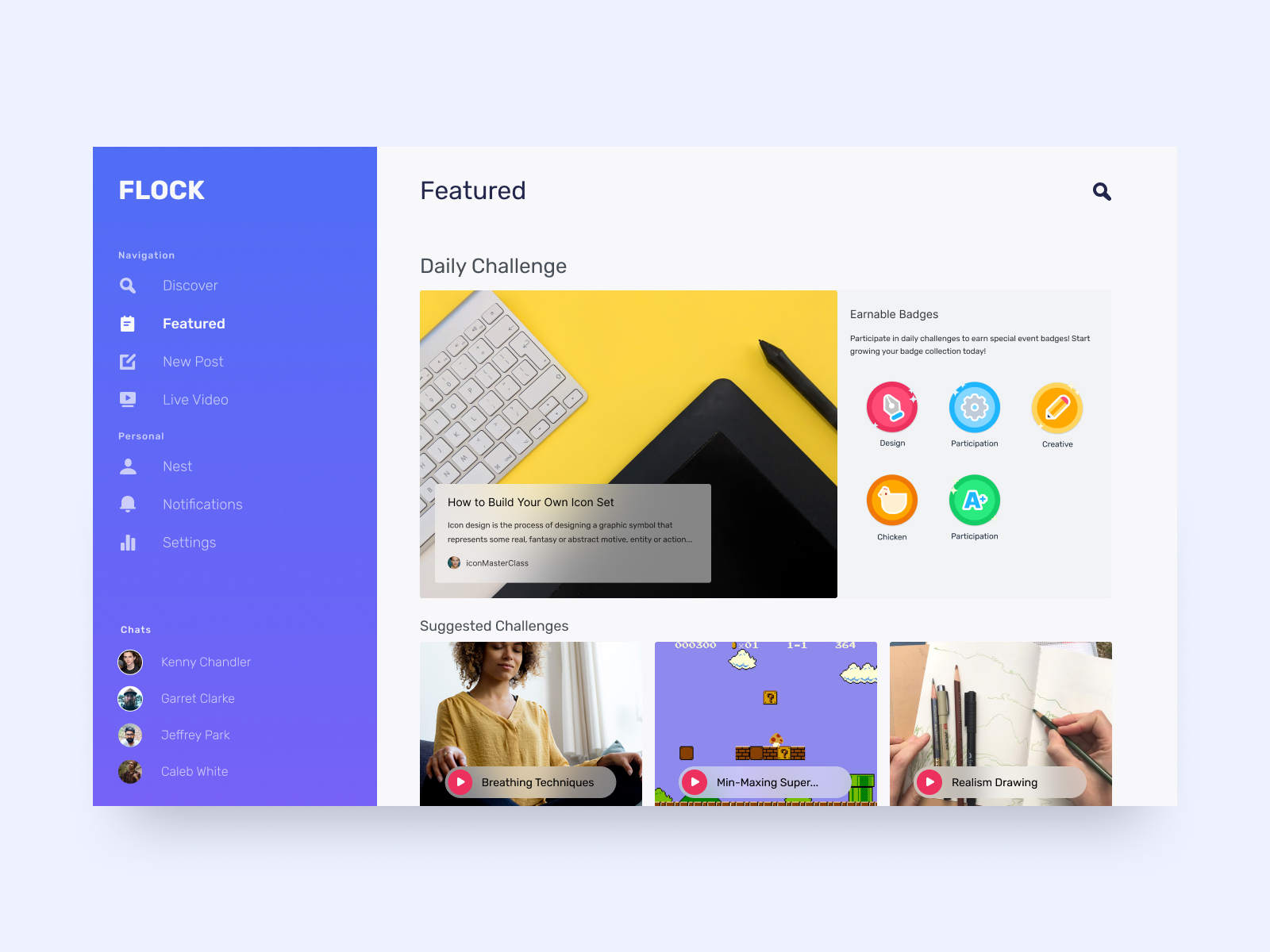
Featured Challenges
New daily skill shares will be updated, giving users the chance to learn new skills from different communities.
↑
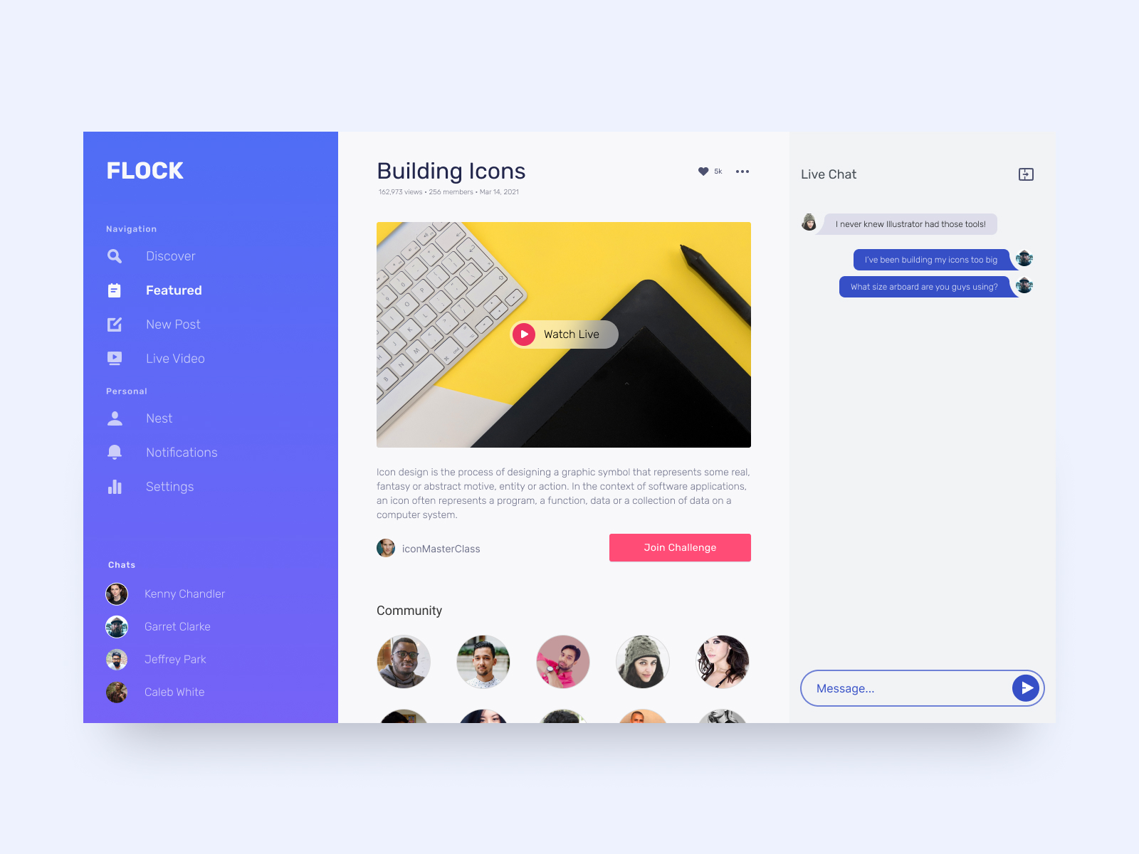
Daily Challenge
Joining daily challenges gives the user more opportunities to earn badges. Upon joining a challenge, users can connect to all community participants.
↑
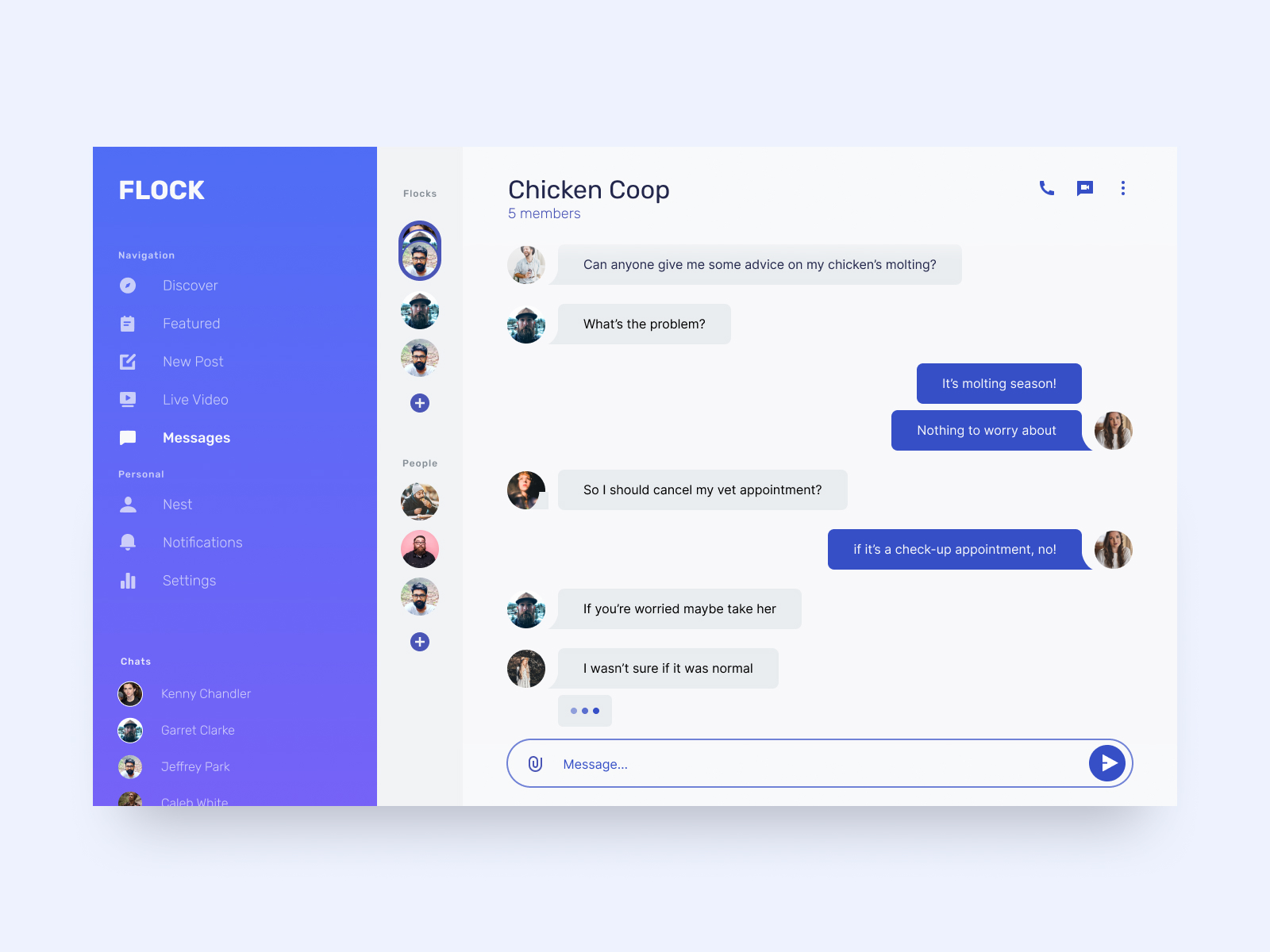
Messages
Users can join and create group discussions called flocks. Allowing community members to stay connected.
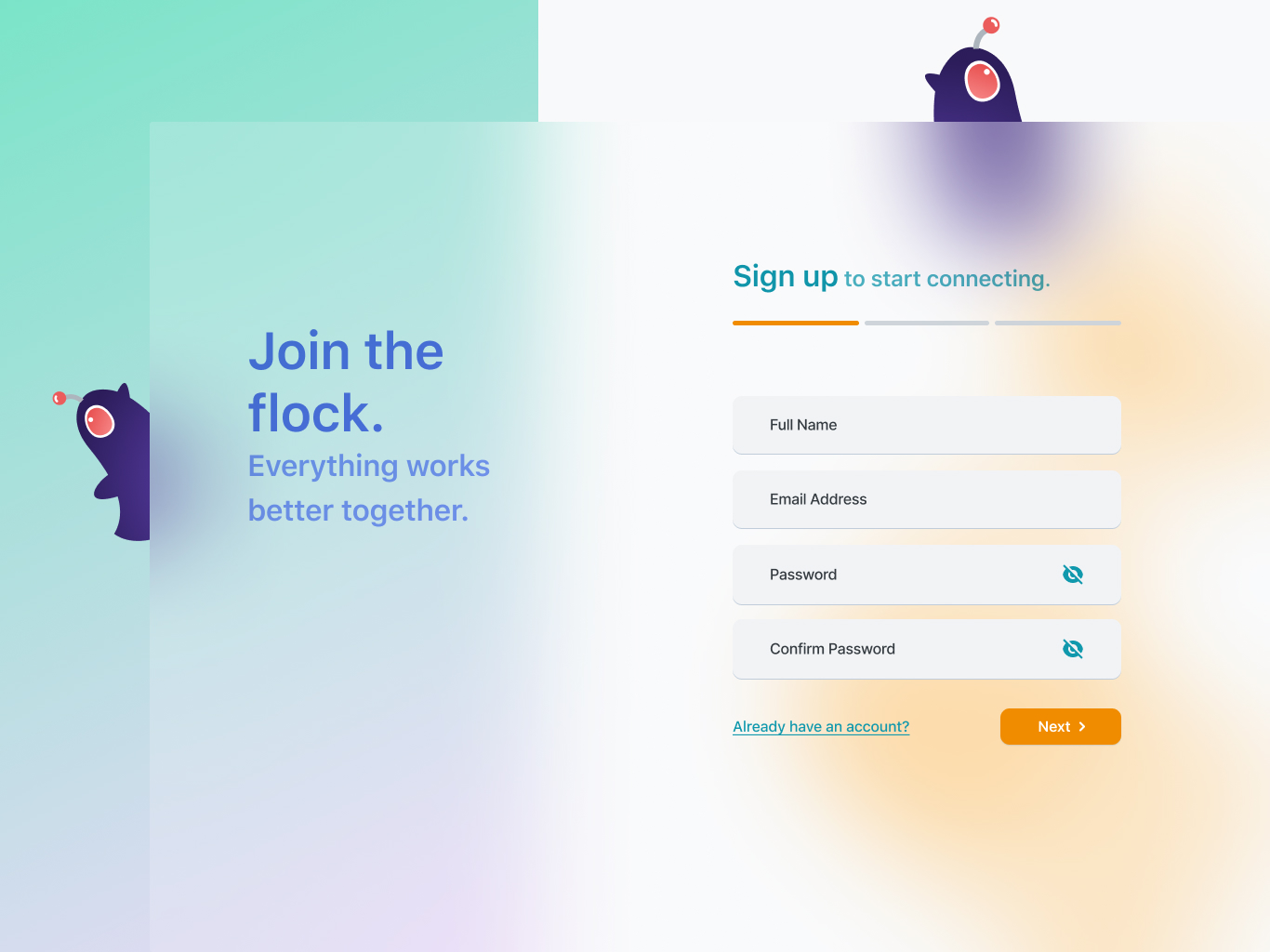 The initial onboarding screen placed a focused on color and a frosted skim appearance. Our magpie mascot, Mag-bot is featured throughout the onboarding process.
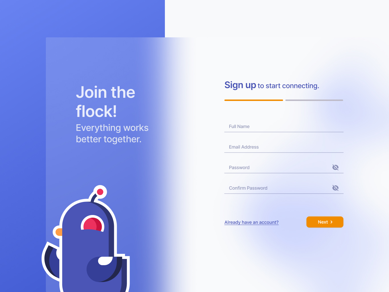 The second iterations of the onboarding screens utilize a simplified color palette, different text-field styles, and a geometric version of Mag-bot featured in Flock's brand colors.
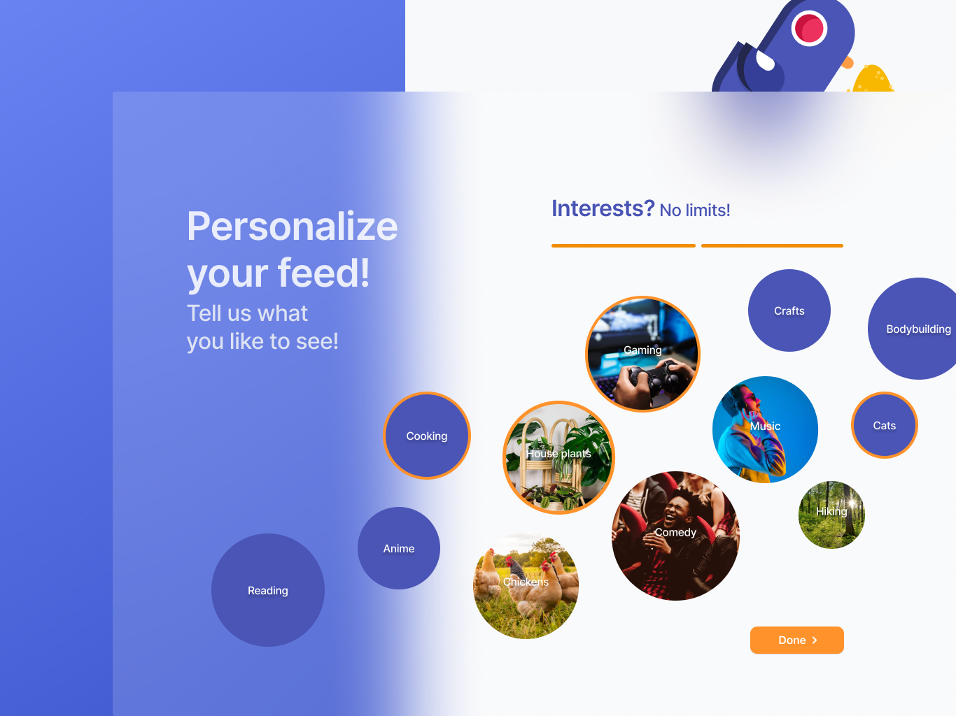 Users are able to curate their feed by selecting the interests that float on the screen. This style and appearance feels dated and displays a limited number of options.
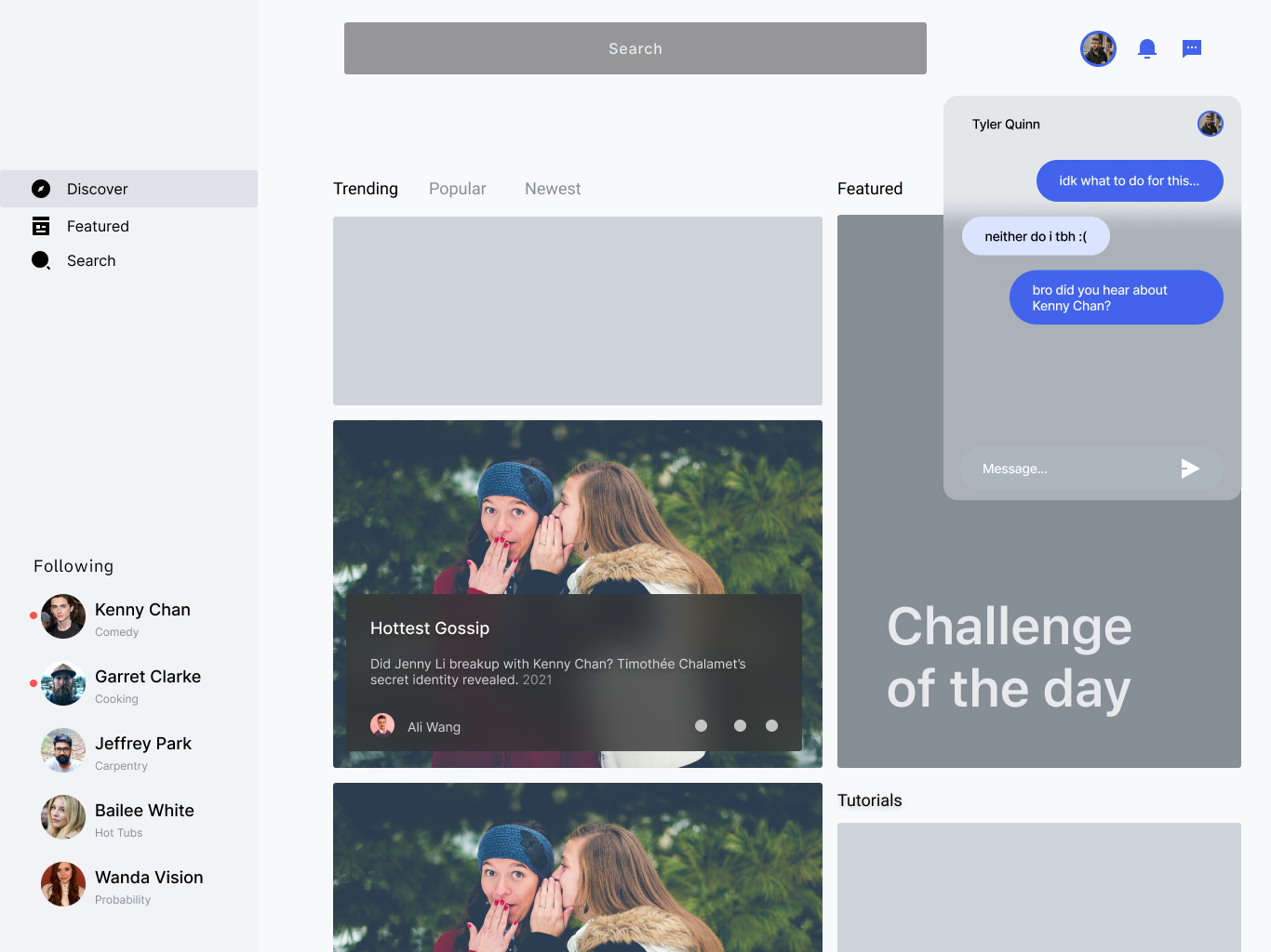 The initial designs of the Discover page uses a similar frosted skim design as seen in the onboarding screens. The messaging feature felt constricted in the upper corner.
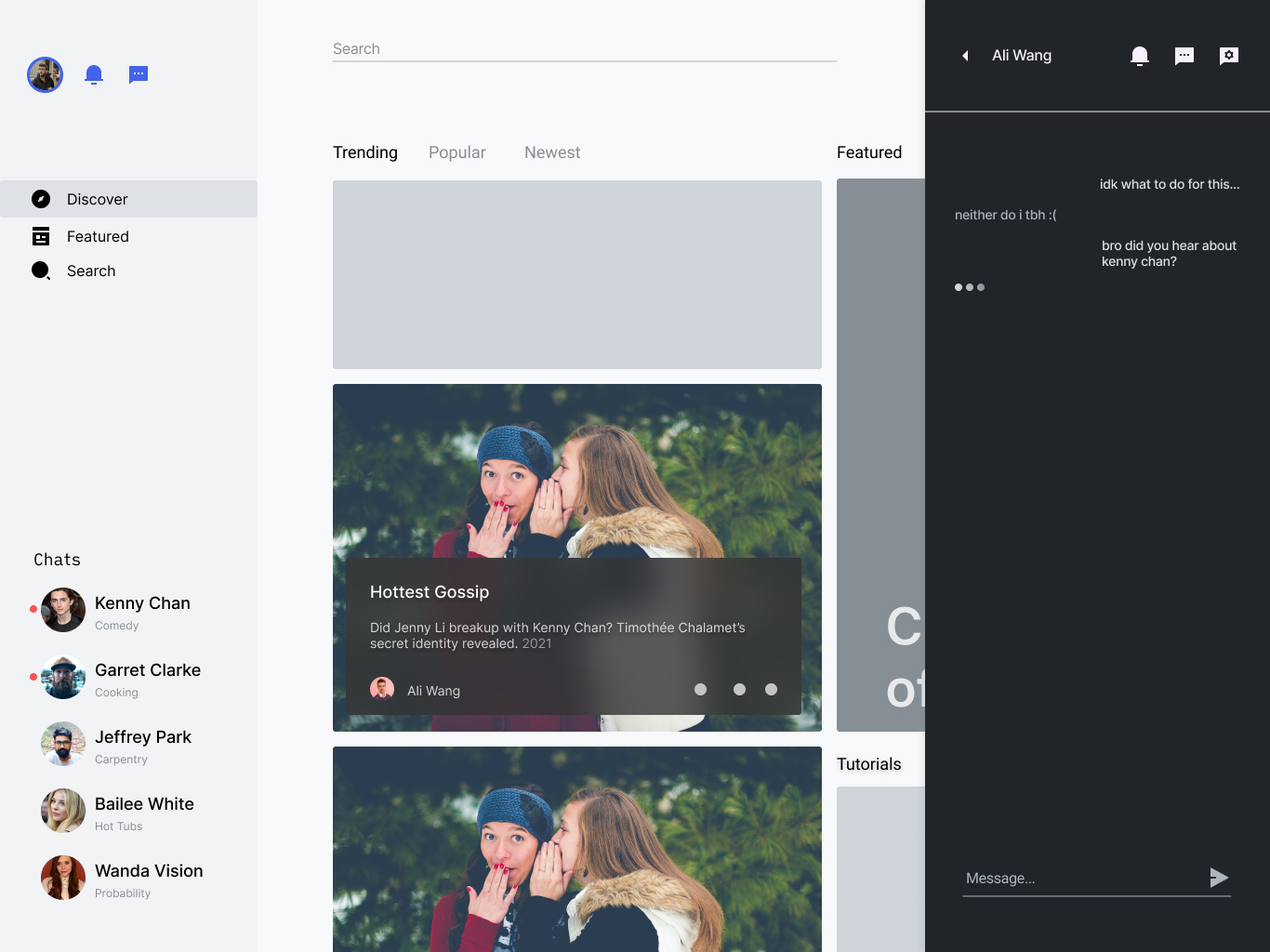 The layout pins the messaging feature on the right side of the screen and displays a compact navigation bar. The profile icon, notifications and messaging icon was moved into the nav bar.
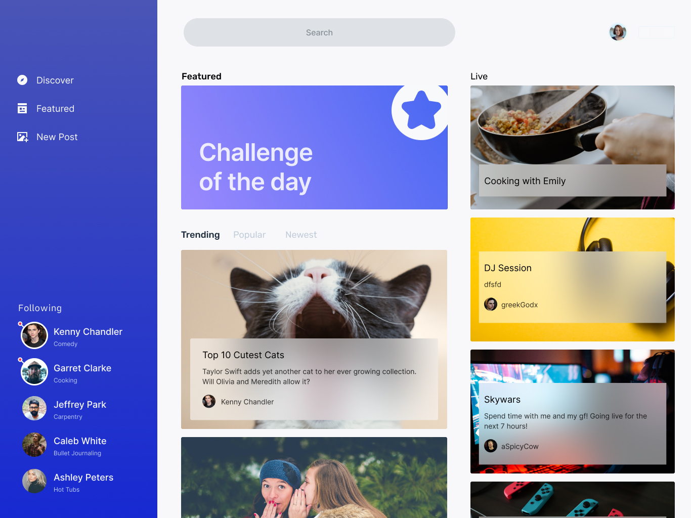 We continued adjusting the layout of the Discover page and expanded the application of our brand elements. Our goal was to bring focus to the daily challenge section.
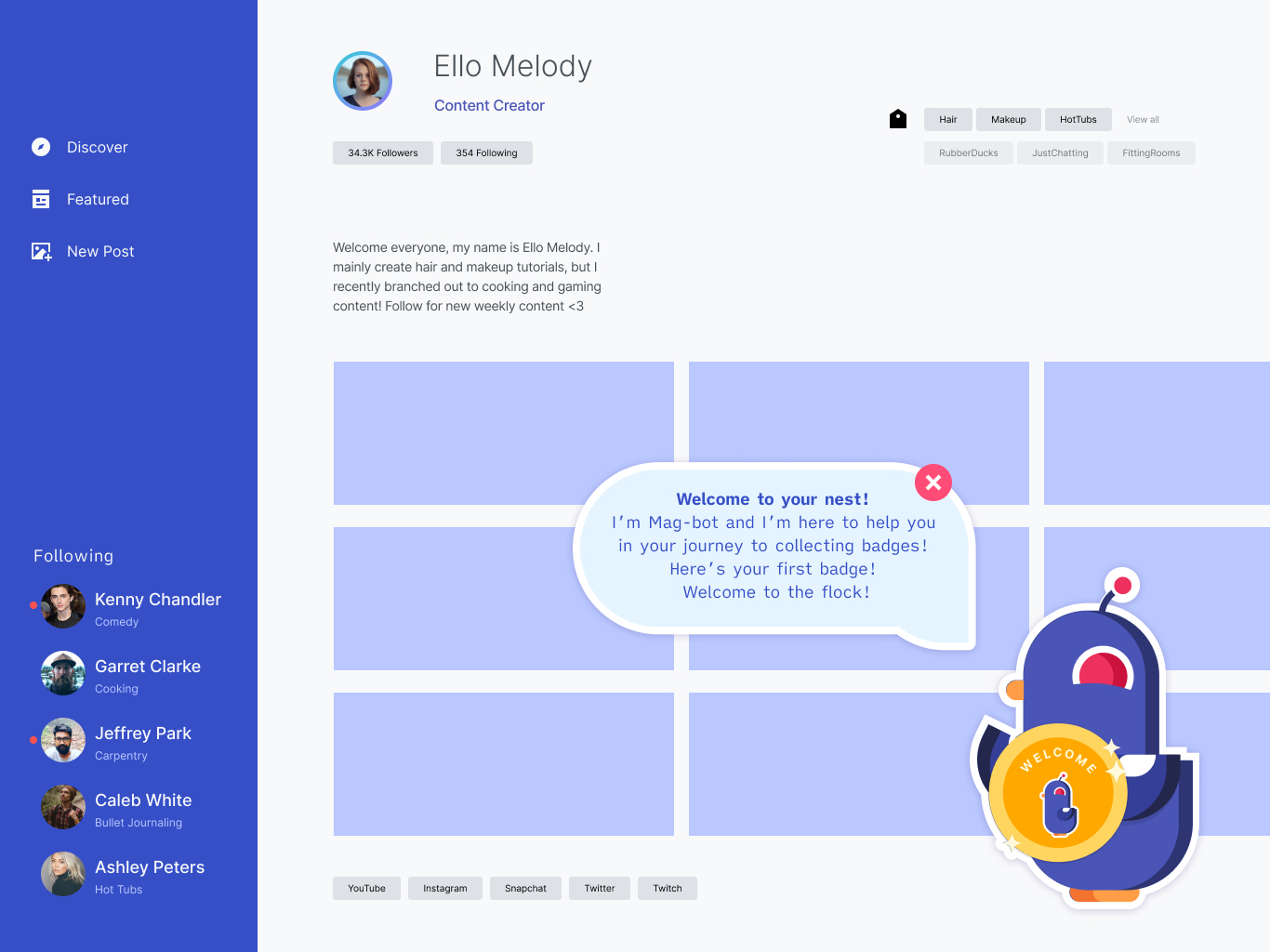 When building the profile screens we were challenged with finding an effective way of displaying the creator content in an organized way. We had trouble including the user's interests in their profile.
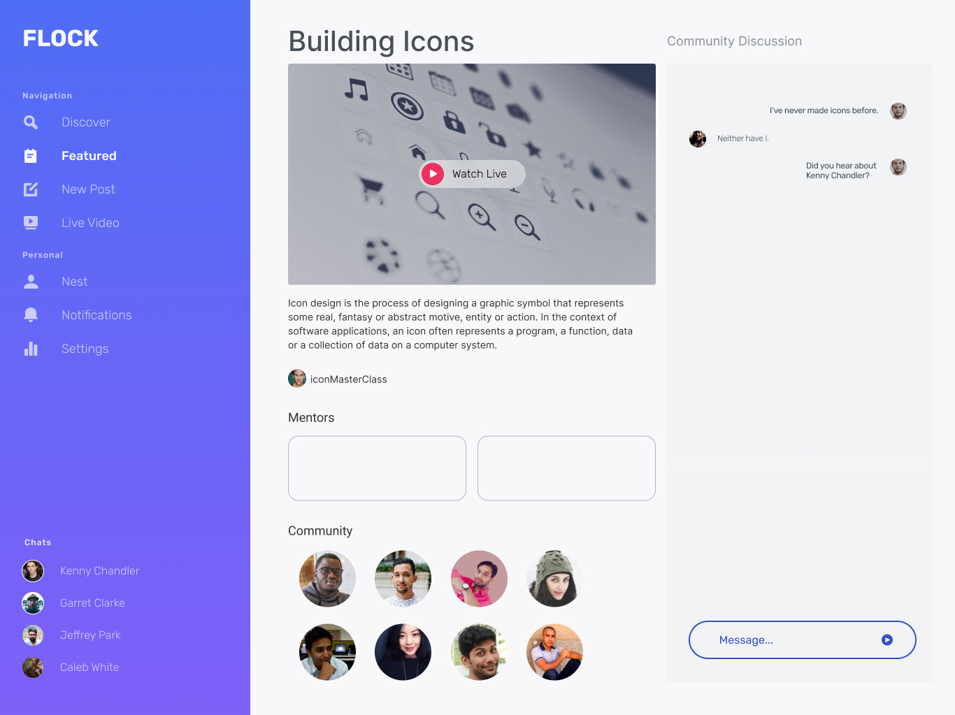 The featured daily challenge page uses a single column layout, with the community discussion pinned to the right side. The author's credibility and number of views was also missing from this draft.
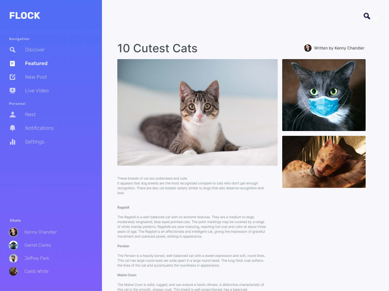 While this editorial layout works for the featured article, it lacks the placement of the comments section. The author's credibility and number of views was also missing from this draft.