Battle Caster
Group 6
While working for Flux Studio at Oregon State University, a client approached my team got about redesigning the app interface of a new mobile card game. Battle Casters is a PVP digital trading card game in which players control a single character’s stats, movement, and attacks through the various cards they control.
-
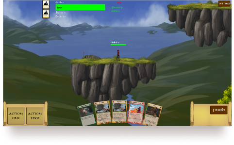 The featured image showcases the in-game screen. This project focuses on redesigning the hud assets of the game.
-
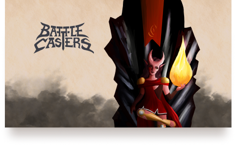 This artwork was created for the mobile home screen and was given to us by the client.
Wireframes
At the start of the project, they showed our team the current prototype game. However they made it clear that all of the current assets besides the logo were placeholders and gave us free rein to create a new look and systems.
Interface
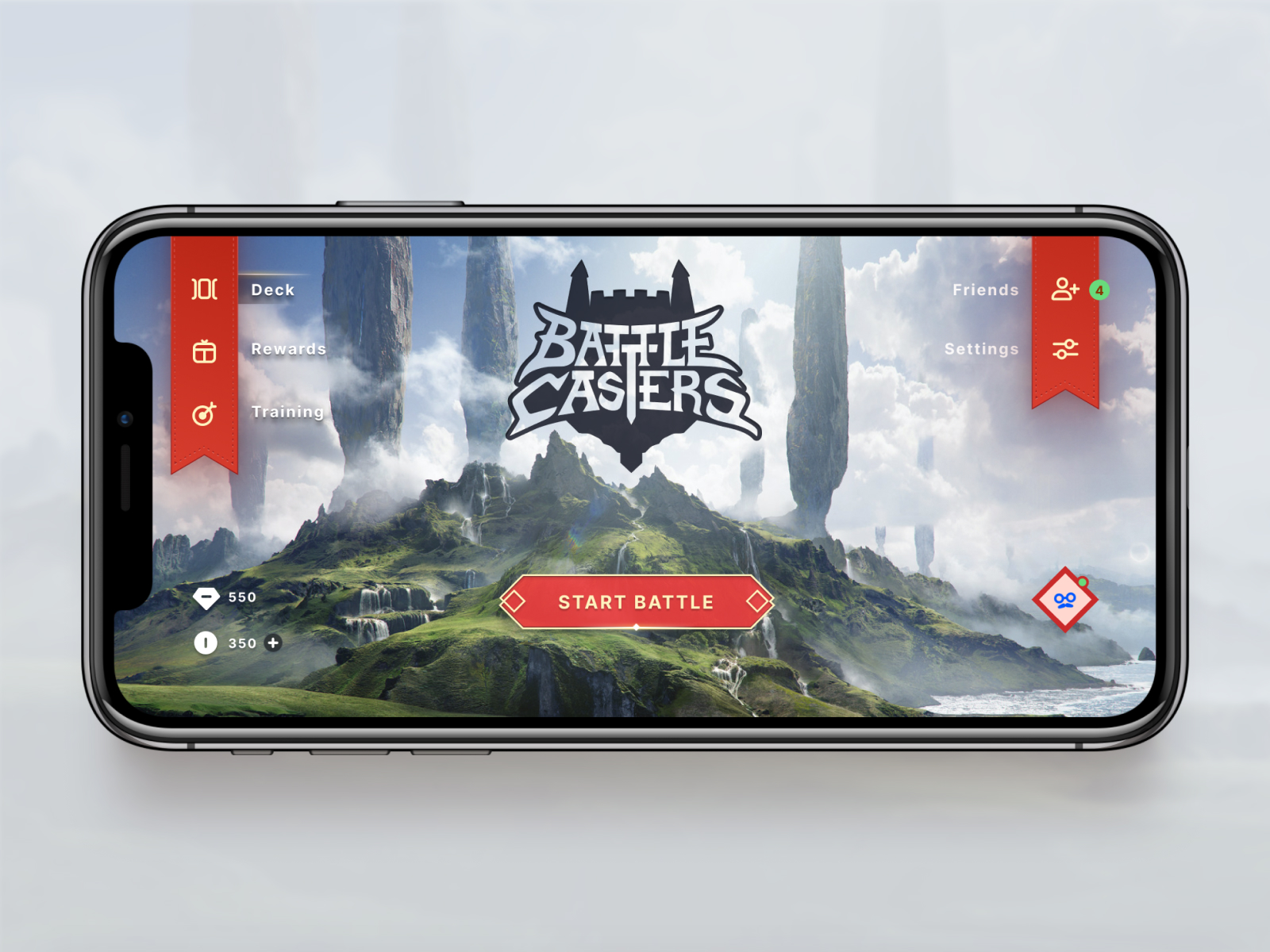
For the new look, we kept the texture paper background. To make the most of the screen and maximize the amount of battlefield a player can see at any given time, we made elements transparent and pushed them off-screen when not active. We positioned these interactive elements at the bottom of the screen to make it easier to hit with one’s fingers.
↑
Mobile Home Screen
We decided to explore the usage of the ribbon from our wireframes, building assets to match the style and sharpness of the angles.
↑
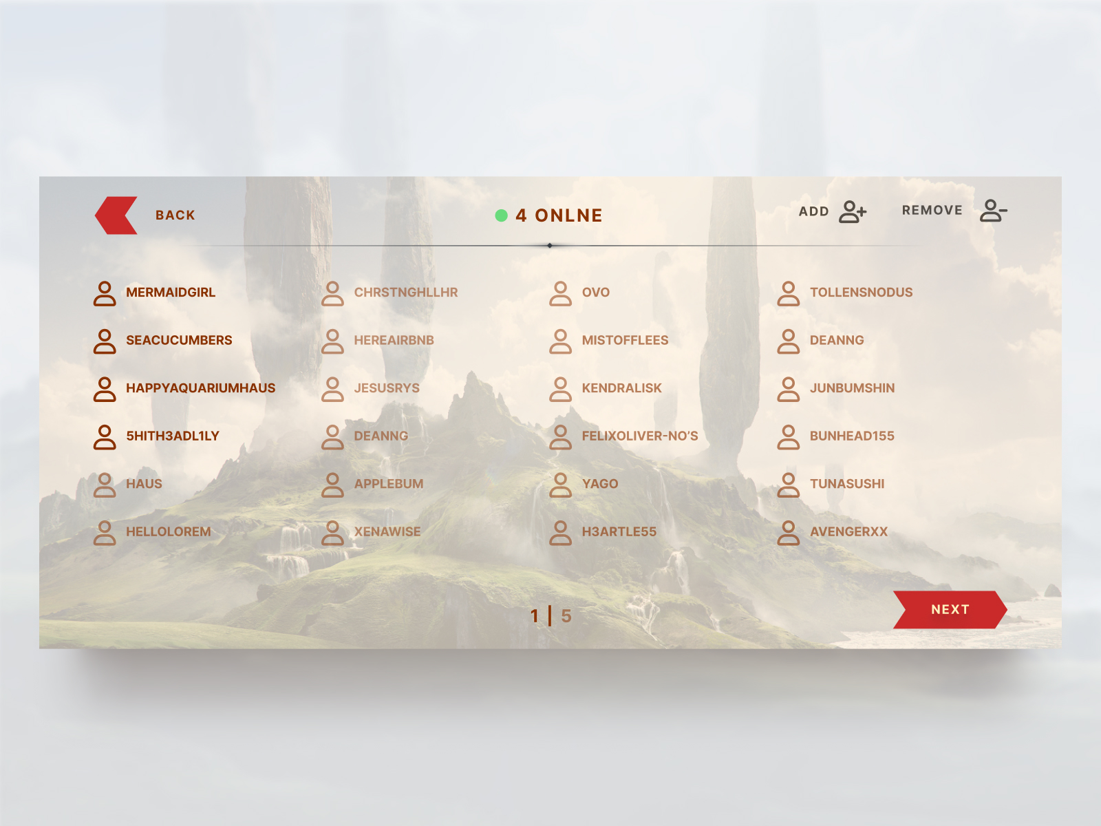
Friends List
Friends that are online appear darker, while those that are offline will appear faded.
↑
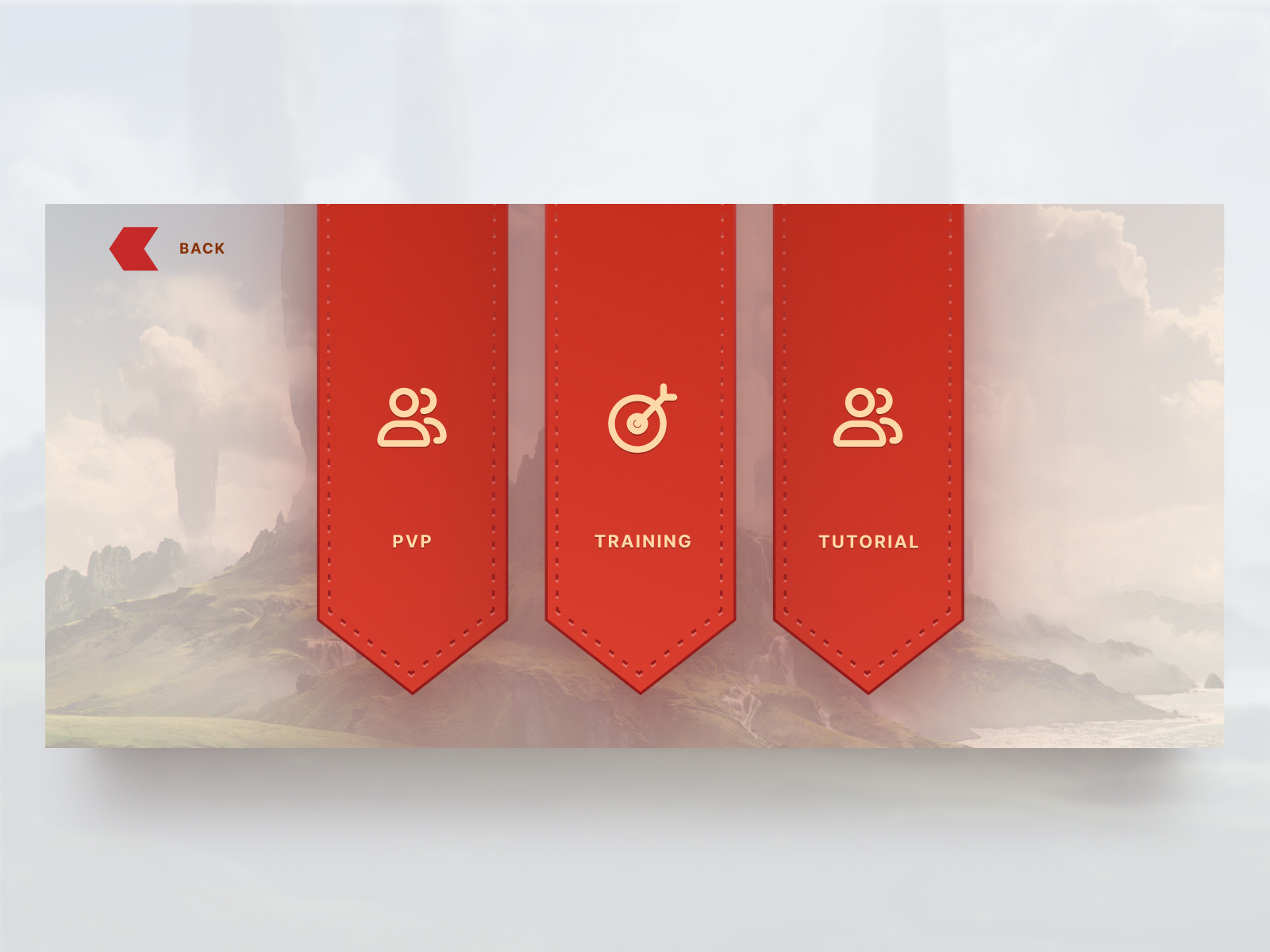
Play Options
The options screen utilizes the same banner design as the previous screens.
↑
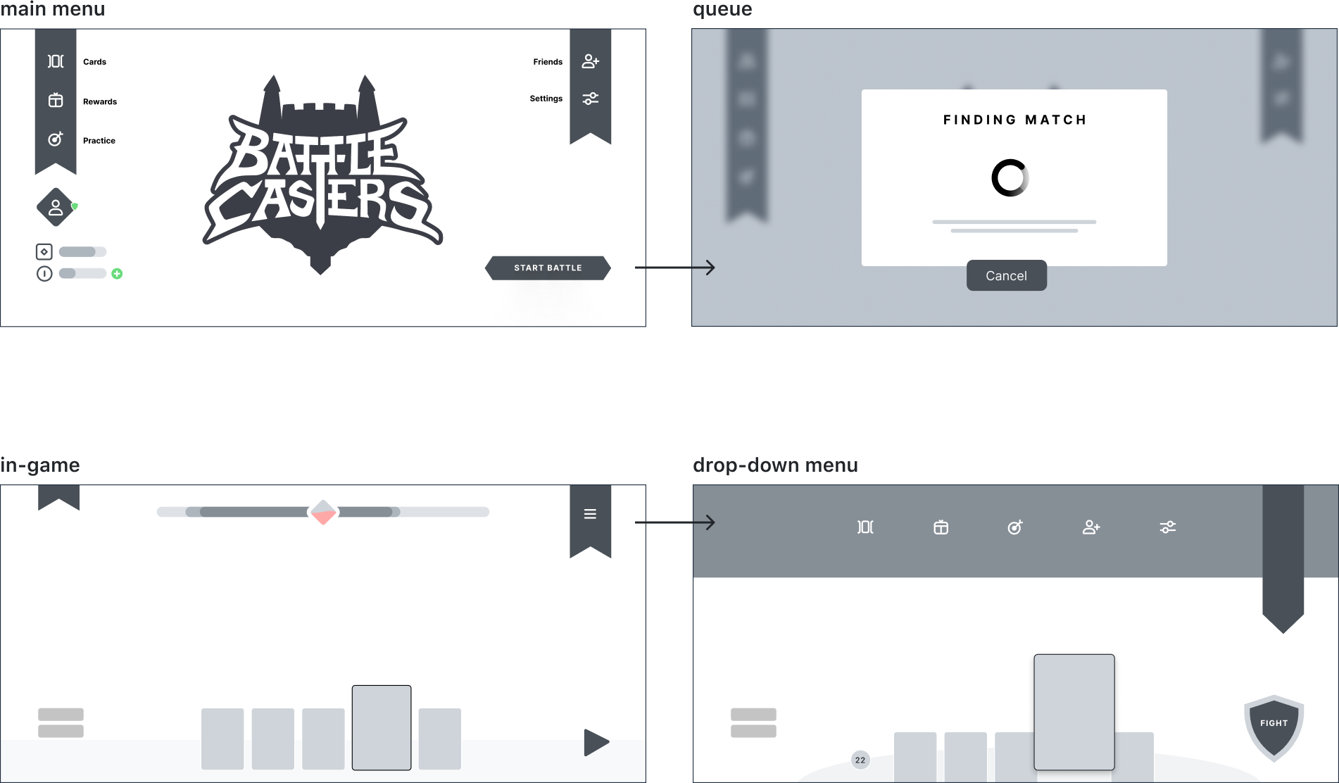
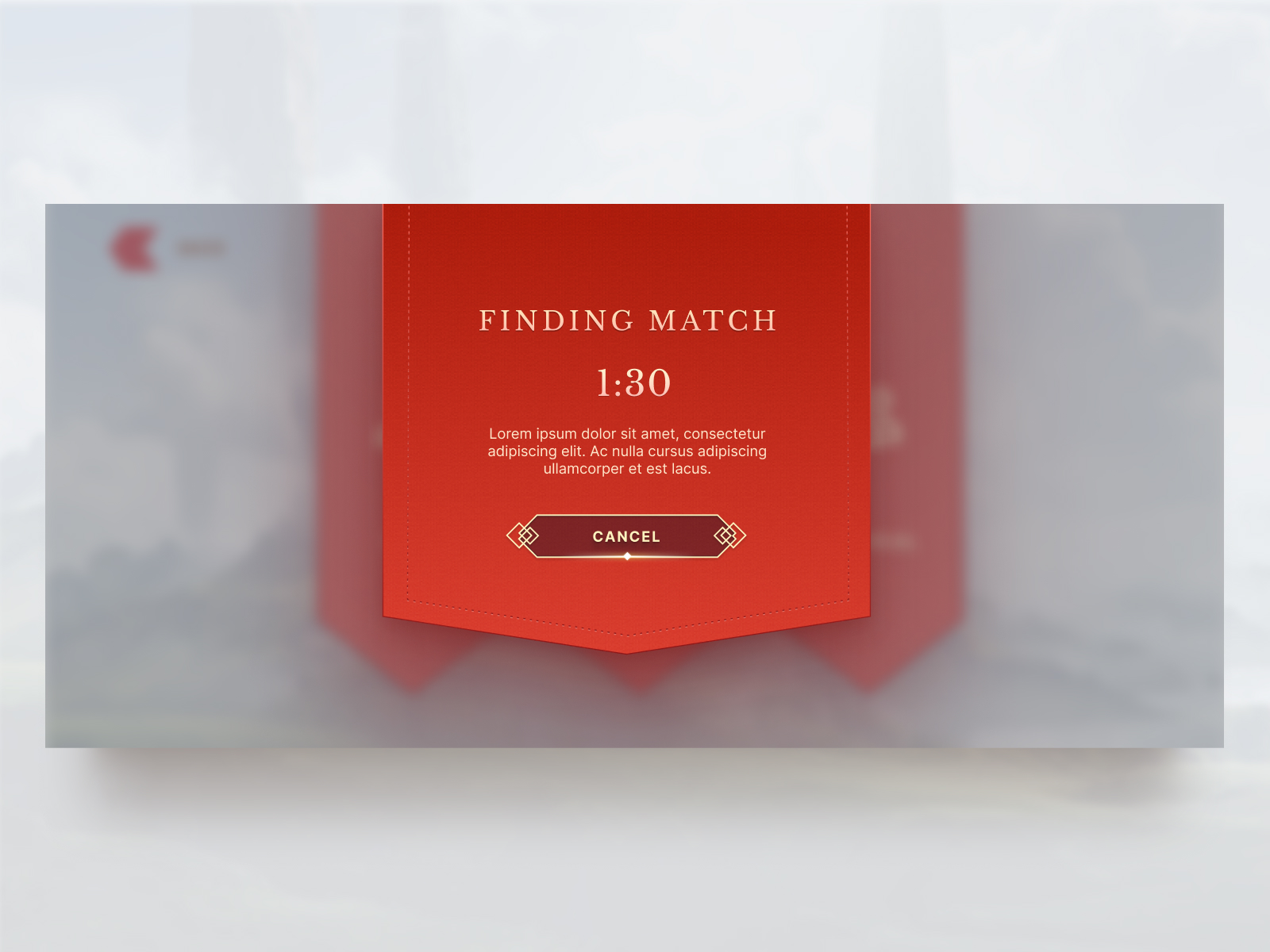
Queue Match
After pressing the Start Battle button, the interface takes the player to this screen. The player has the option to challenge other online players, train their strategic skills, or walk through a tutorial.
↑
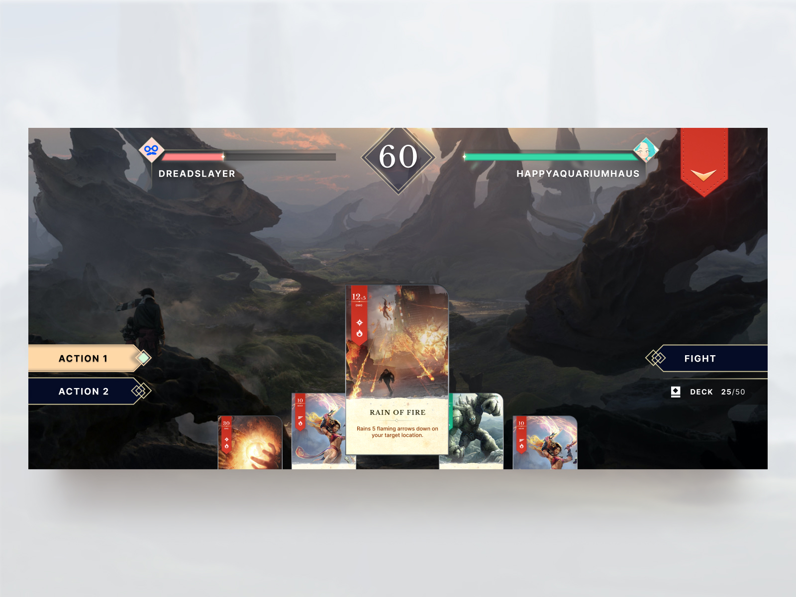
Mobile In-Game
The buttons and other hud assets utilize diamond shapes, the profile icons action button and count down timer as well.
↑
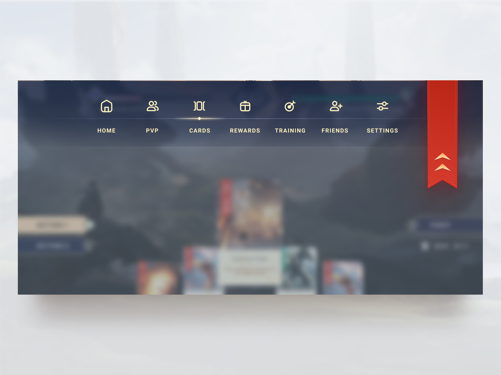
In-Game Drop-Down
The ribbon drops down and inverts the direction of the arrow.
We used transparency and light to make the interface look more open and indicate information. To make sure that text would still be readable even on a light background we used subtle drop shadows and a slight blur effect along with a generous text-shadow.
Card Redesign
While not in the initial brief, the design team felt that the current card design did not match the new UI assets and was not very legible when shrunk down to fit a mobile phone screen.
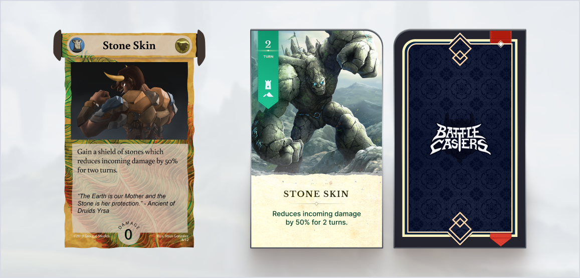
Some of the biggest changes were cleaning up the card shape and remove the textured background. To make the text more legible, we increased the font size and removed unnecessary elements such as flavor text and artist description. Instead, those elements were moved to the deck builder page. The team also moved the damage amount to the upper left to increase visibility.
↑
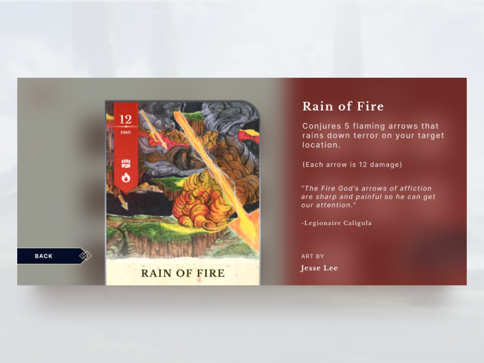
Card Details
By removing the flavor text and artist credit from the card the player spends less time reading during in-game battles.
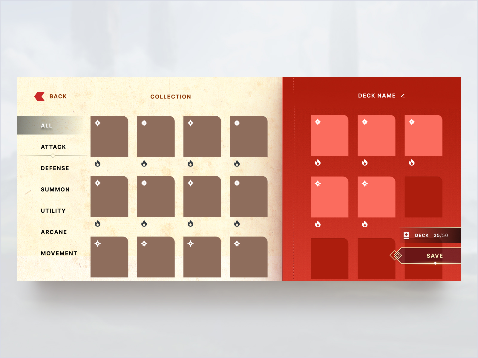
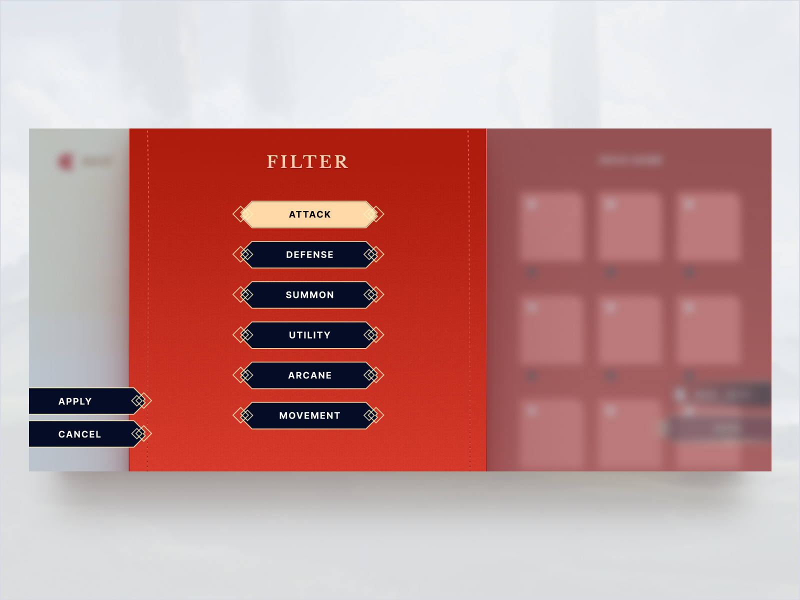
Deck Builder
The deck builder iterations were one of the final screens created for the client. Using the design assets we’ve created, the deck builder uses the same UI buttons, banner styles and typography treatments.
↑
Mobile Deck Builder Draft 1
↑
Mobile Deck Builder Draft 2
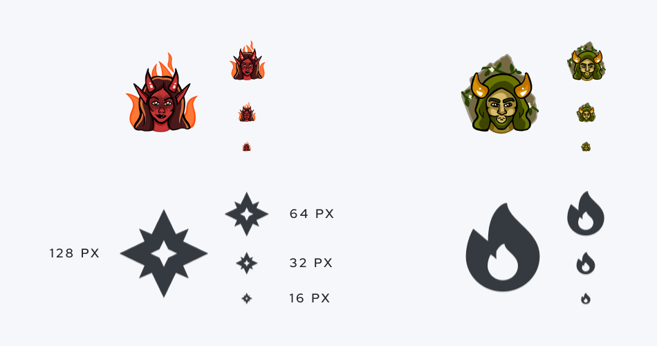
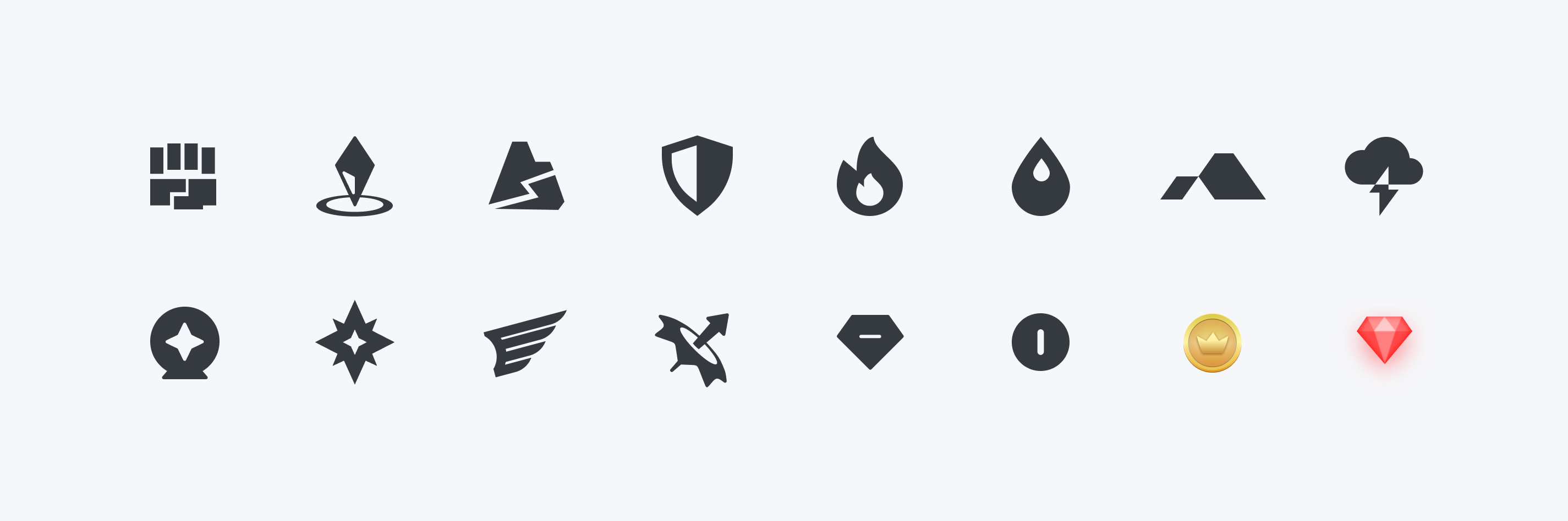
Symbols
The last component of the card we changed was the element symbols. The original symbols were more artistry rendered but did not scale well when smaller than 32px. Therefore a team member came up with a simpler flatter, more scalable symbol.
Development
After the contract with our client ended, they took the design assets we created and implemented them into their game. While the client liked what we created, they modified our designs into their game. The following screens were not created by the design team, and is currently being developed by Group 6.
↑
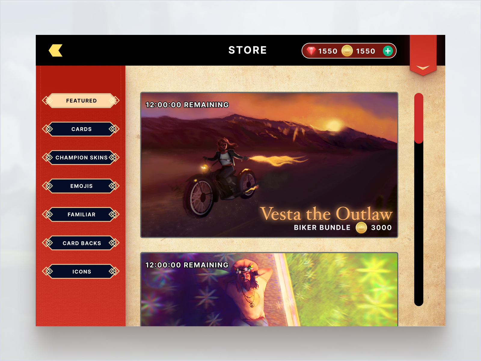
Desktop Store
↑
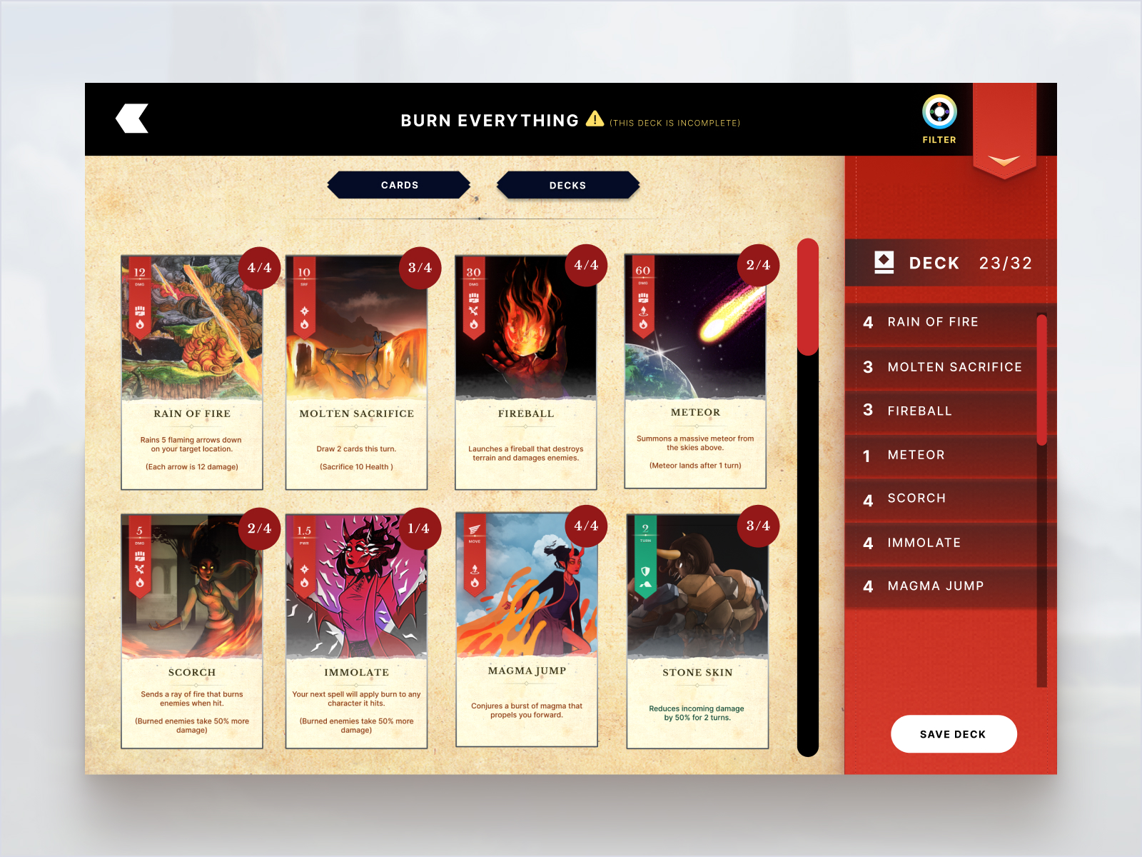
Desktop Deck Builder
↑
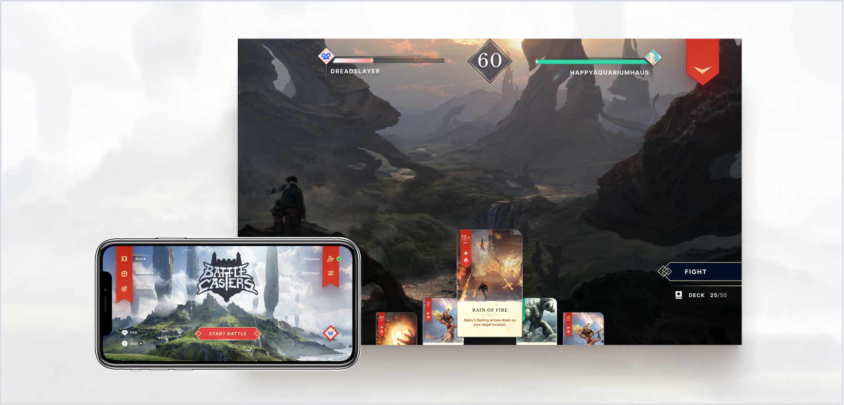
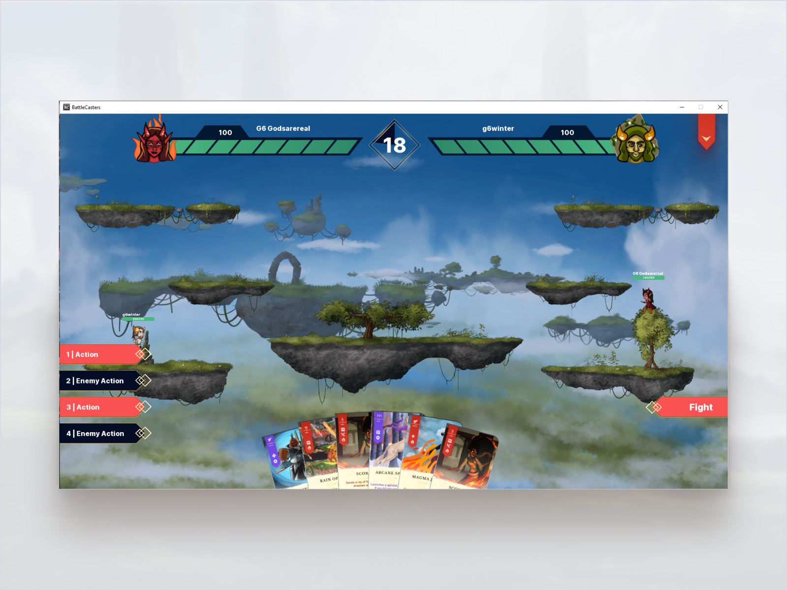
Desktop In-Game
The cards in the player's hand are displayed in a different style, the interface buttons are simplified, and different health bars are being used.
↑
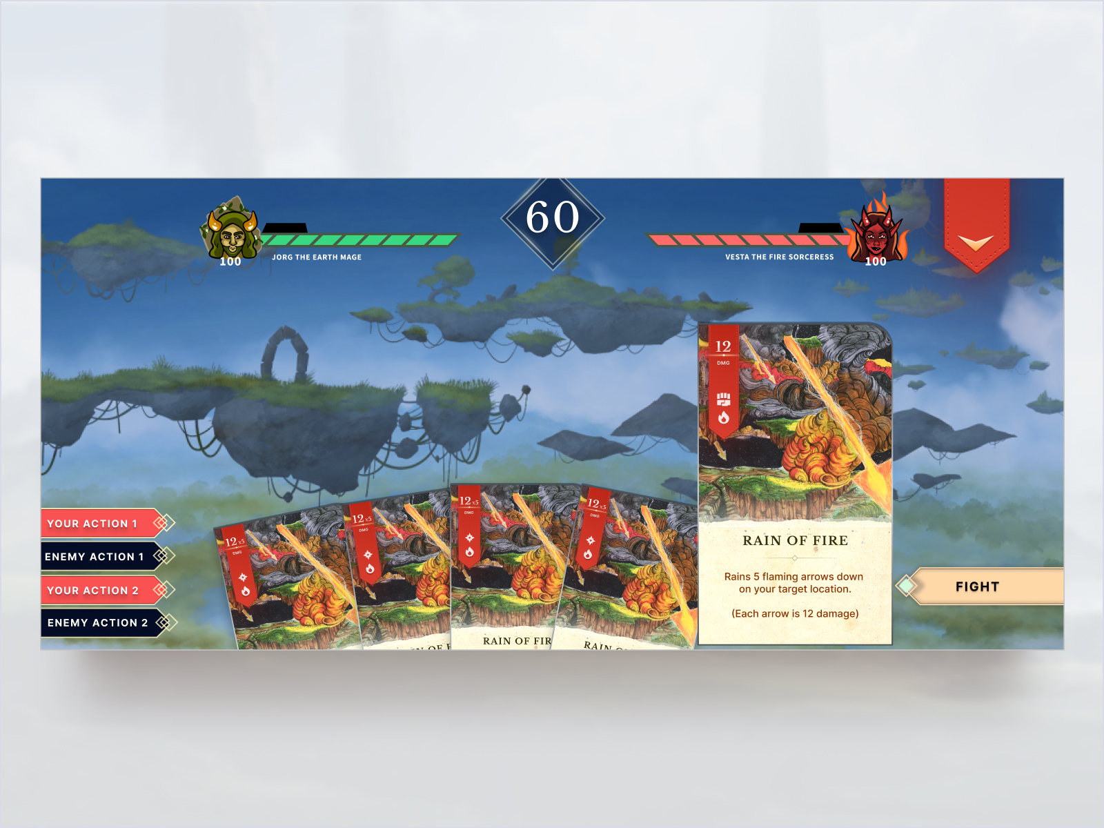
Mobile In-Game
On mobile screens, our card designs make it easier for the player to quickly read the card description, and see the damage counter in the top left corner of each card.